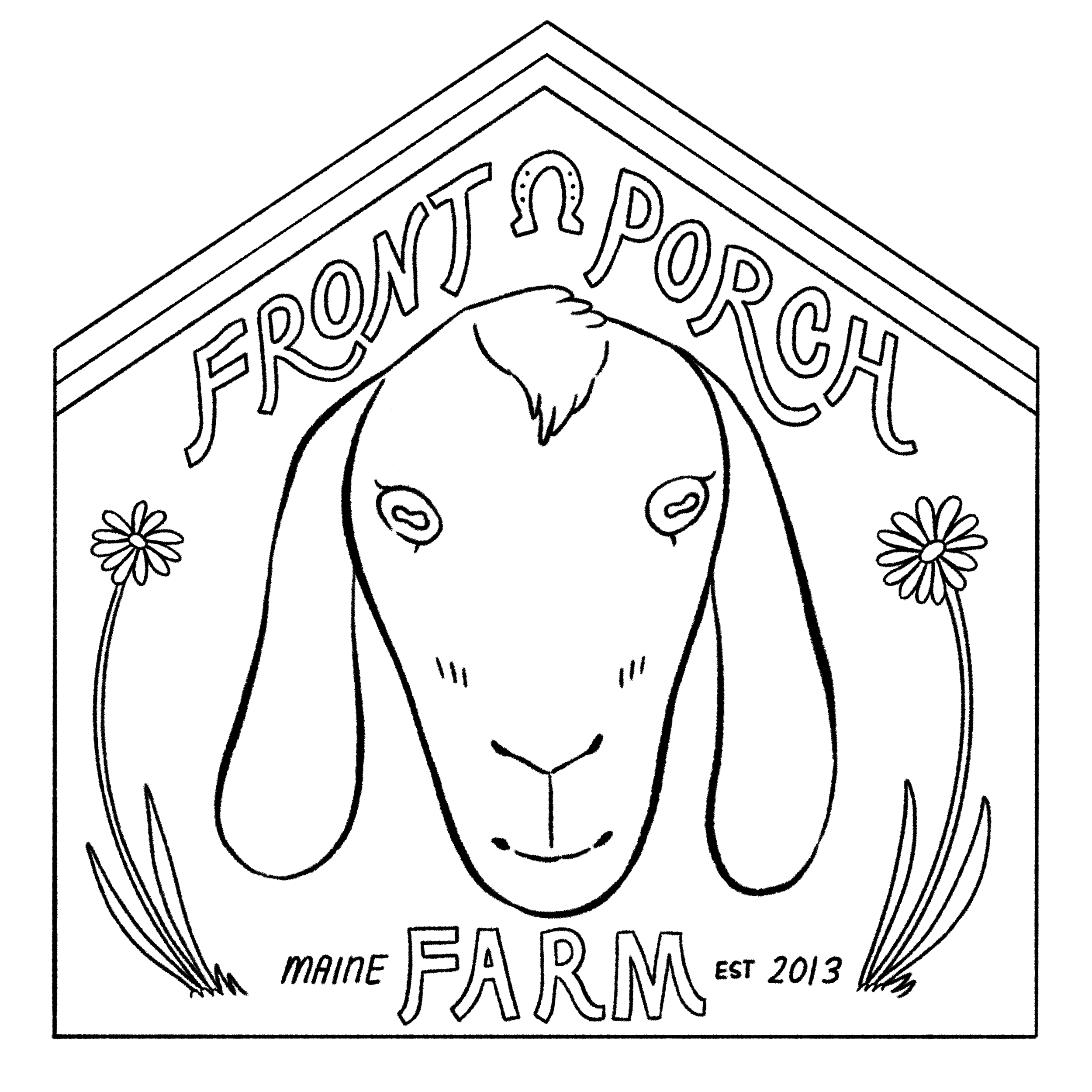
illustrated logo
the pitch
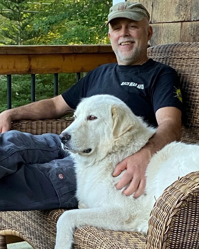
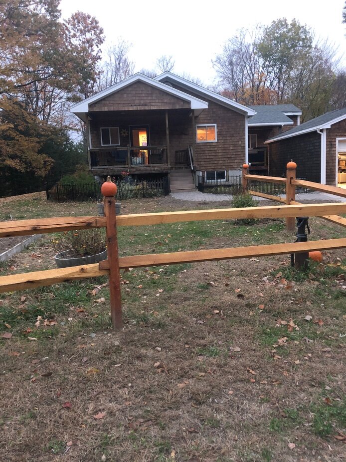
Clients Susan and George Marcoux of Front Porch Farm, Maine
Assignment designing a full-color illustrated logo for Front Porch Farms
Requirements be bold, easy-to-read, include the business' name, legible both large and small
Usage labels, websites, stationery, product labels, t-shirts, other merchandise or signage
Specs the final logo will be a full color 300dpi jpg and a 72dpi web-quality image
ABOUT THE CLIENT
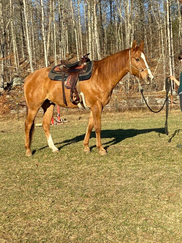
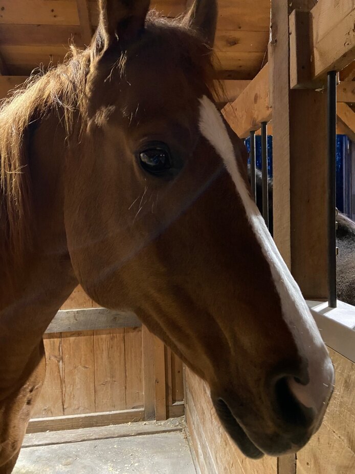
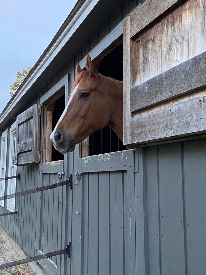
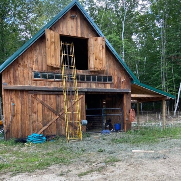
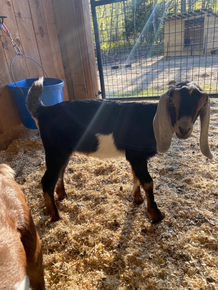
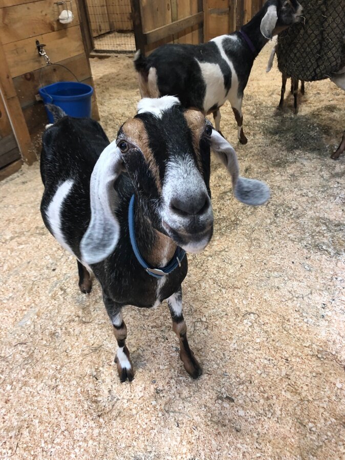
They are a micro dairy in Shapleigh, Maine, started about 7 years ago. A retired married couple that are starting a new venture. They have chickens, ducks, 10 goats, 2 dogs, 3 cats, 2 pigs named Ping and Pong and 1 newly acquired horse. They make cheeses, yogurt, candies, bread and soap from their lovely goat's milk and eggs from the chickens and ducks. While they only sell from the farm at the moment, they plan to be at local farmer's markets and a local business in the future.
“dreaming on the front porch of our home looking out over our farm pond while sipping coffee every morning... and have slowly been building that dream for our "golden years"
THEIR VISION
![They have a handmade [wood] sign hung on their front porch a few years ago.](https://images.squarespace-cdn.com/content/v1/5f1f92fef2ddf7039d5148d9/1605323889415-C1DT4PC4OA0WJFJ3PIOB/ATleaFCARYF36TDGP3In.jpeg)
They have a handmade [wood] sign hung on their front porch a few years ago.
“I would say we try to keep things as simple as we can in this complicated world. I am grateful to live a slower paced life and relieved from some of the worst life offers. Our vision for a logo was one that reflected our front porch dreaming and our love for our little, whimsical farm.
[Our] favorite colors are nature inspired (blues, greens, and such) as well as the cheery colors from our gardens - Daisies [and tiger lilies] are our favorite flowers!”
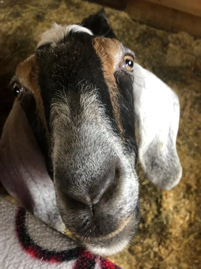
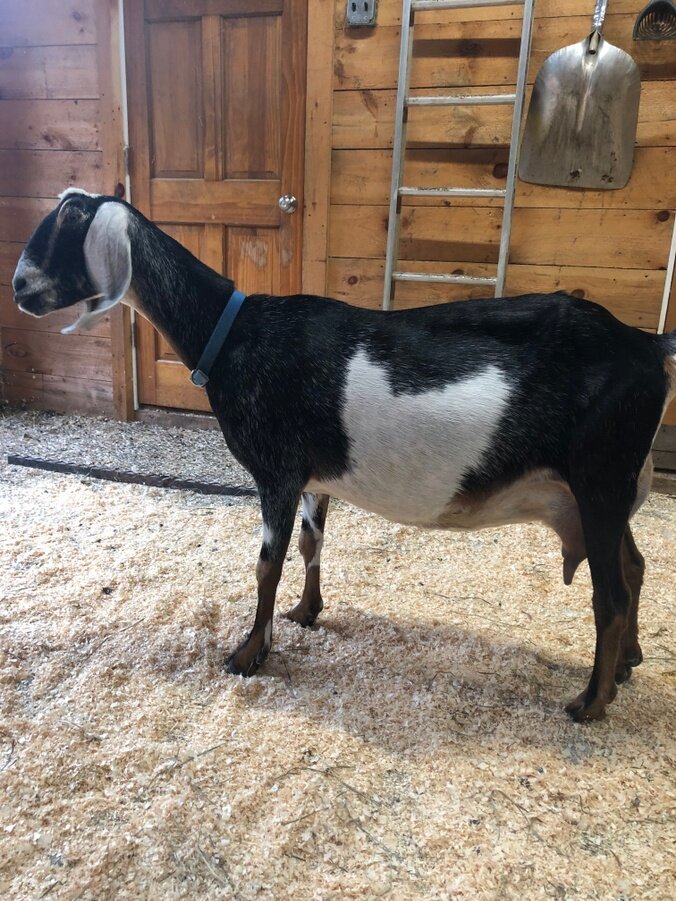
Their matriarch goat is named Daisy and she is a quiet, sensitive and picky goat!

SKETCHES
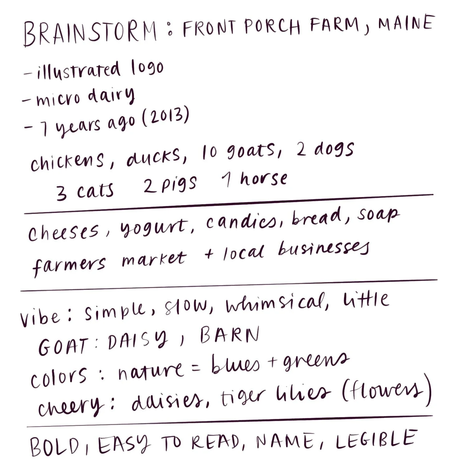
The preliminary sketches and client feedback are shown below. There are a few color tests that I did in order to try and choose the direction that I would pursue for the logo. I wanted to try and keep it somewhat true to the client’s farm and animals.
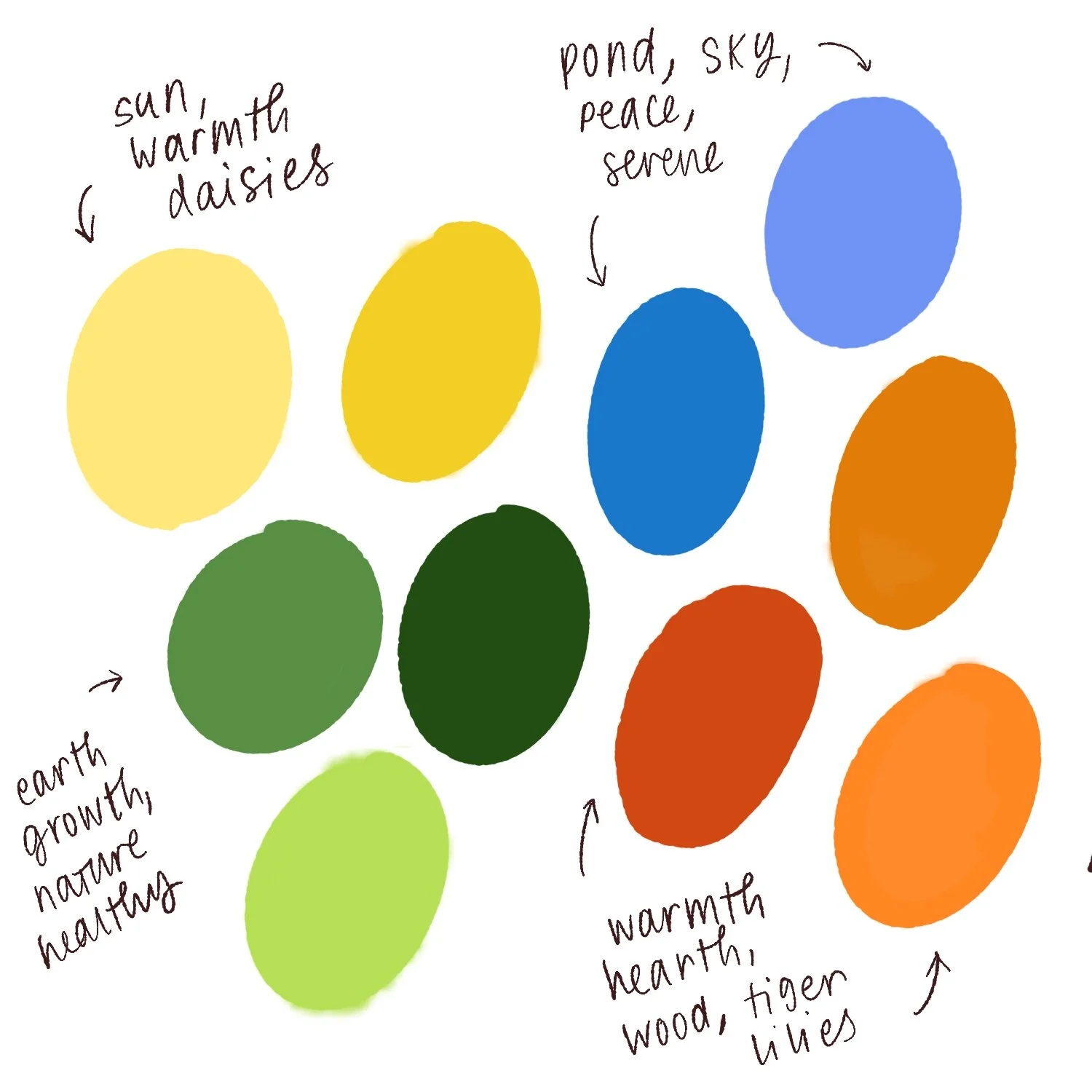
(left) a brainstorm of elements I wanted to include and keep in mind. (right) the color palette I created that I wanted to use, along with word associations behind the different hues. (below left) 3 concept sketches with notes along with color tests of concept sketches. (below right) my thoughts and notes on the designs and colors along with client feedback.
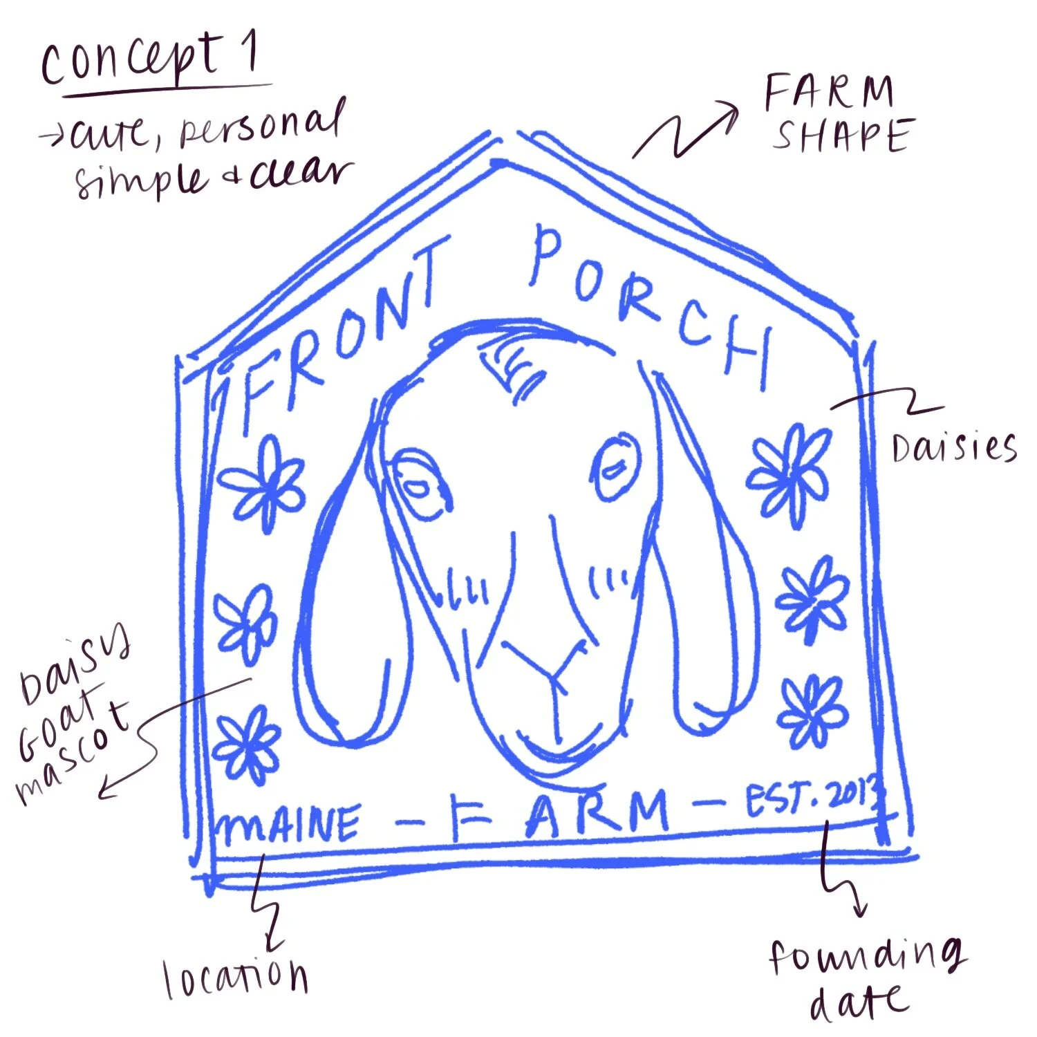
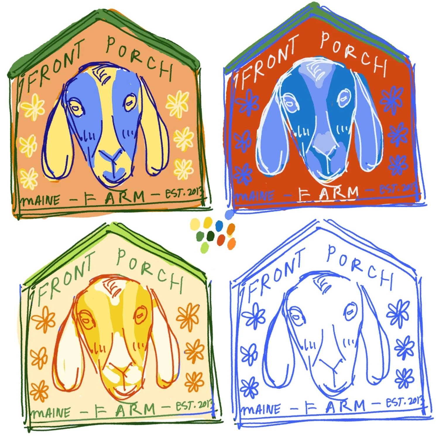
Concept 1 Thought Process I wanted a simple logo, Daisy and the Farm. I referenced the image of daisy for the design but her face markings are simplified as I didn’t want it to get too busy. I included daisies as that is her name and the client’s favorite flowers. Could look great small and clear from far away. For the colors the first image has the green and orange from the reference photo of their farm. The second test has a more generic red/green farm with a monochromatic Daisy in contrast with the red. The third was a more analogous look.
Concept 1 Client Feedback Inclusion of Daisy was nice, however it might read a little generic. The 2nd color test is out as that isn’t the color of the Client’s farm. The 3rd color test is too unclear from afar. We like the first color test as it’s the same colors of our Farm, and while we didn’t expect to like the blue version of Daisy, we do.
Response to Feedback I am moving forward with the first color test.
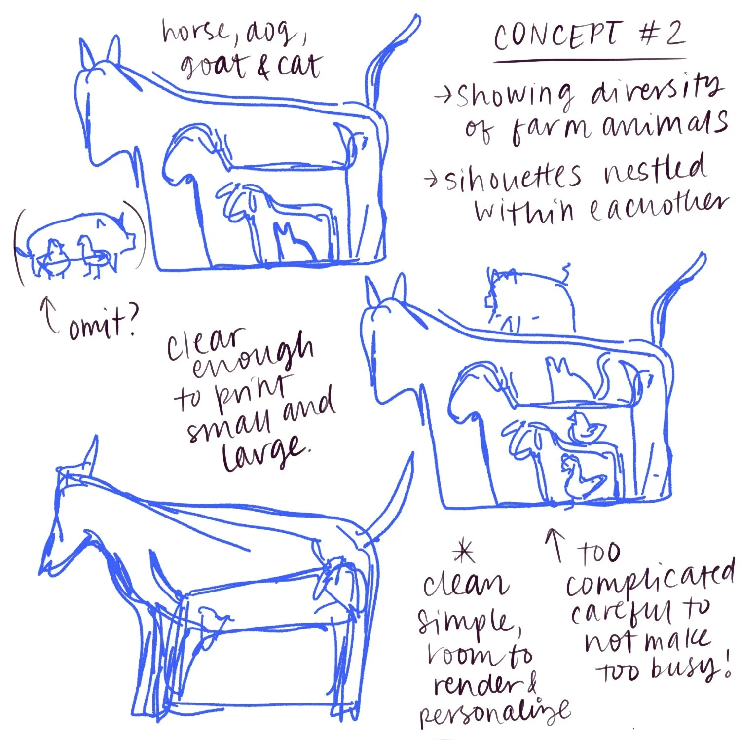
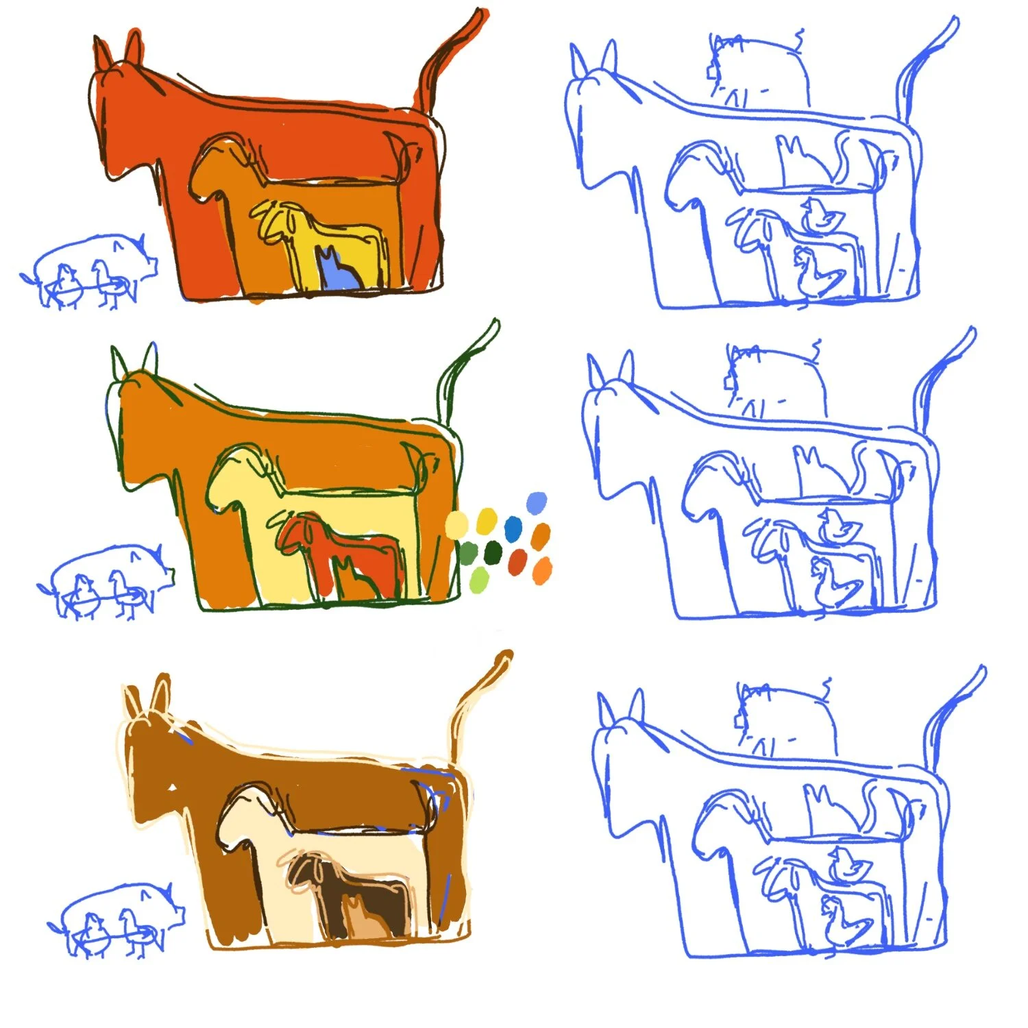
Concept 2 Thought Process For this logo I wanted to incorporate all the different kinds of animals on the farm, reminiscent of a children’s story how they all interact. The first version had every animal included middle drawing. Then I simplified it to just have their silhouettes nestled within one another, just including their new horse, their dog, Daisy the goat and a cat. The last version of this sketch had all silhouettes nestled again but having each animal face a different direction.
Concept 2 Client Feedback The concept is nice, but the image with all the animals is too busy. The first concept is the most successful although it doesn’t read like a farm. The clean silhouettes could be interesting but it might be too graphical, not enough “warmth.”
Response to Feedback After consideration it reads more like a veterinary and I don’t know how I would incorporate the name, so I decided to not pursue this version.
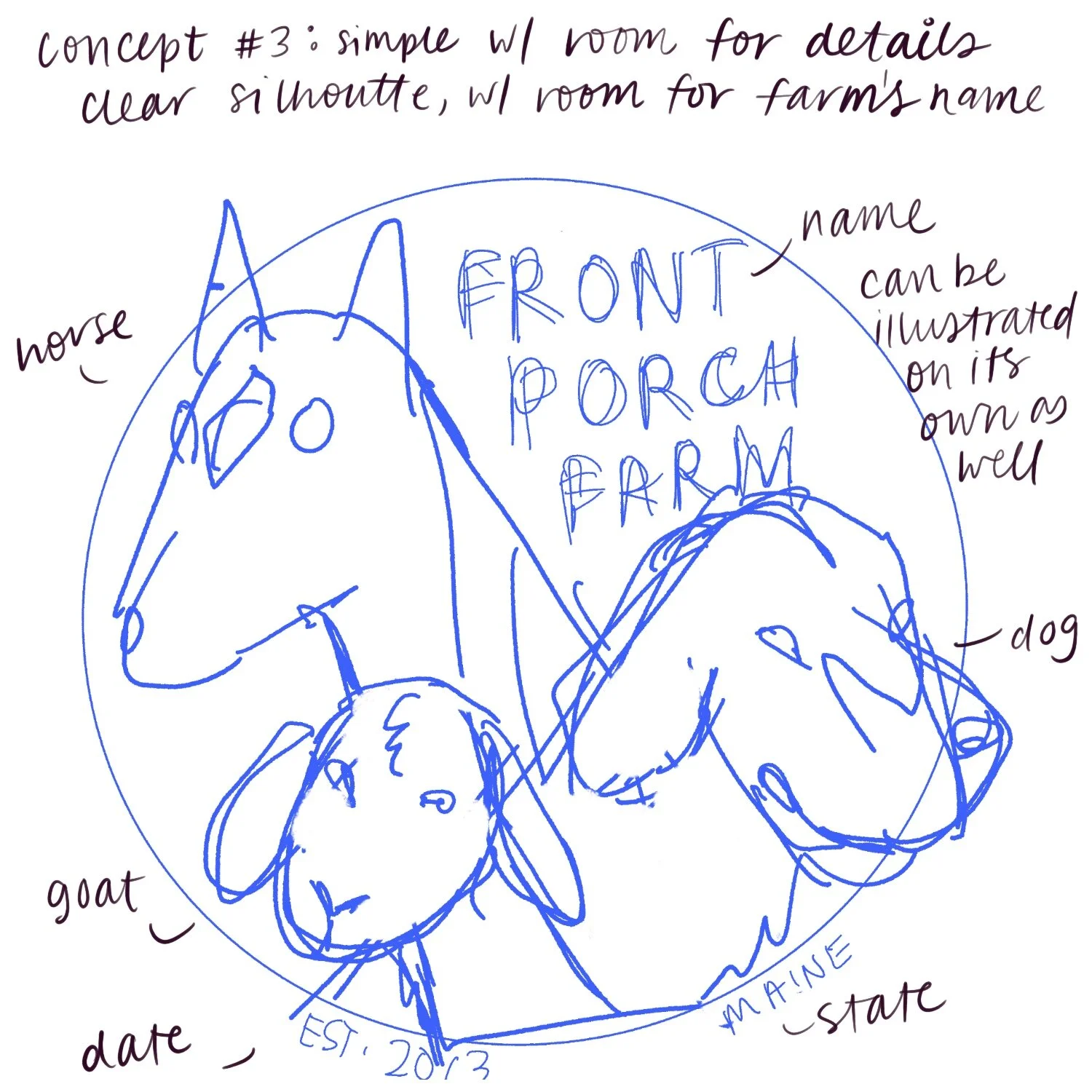
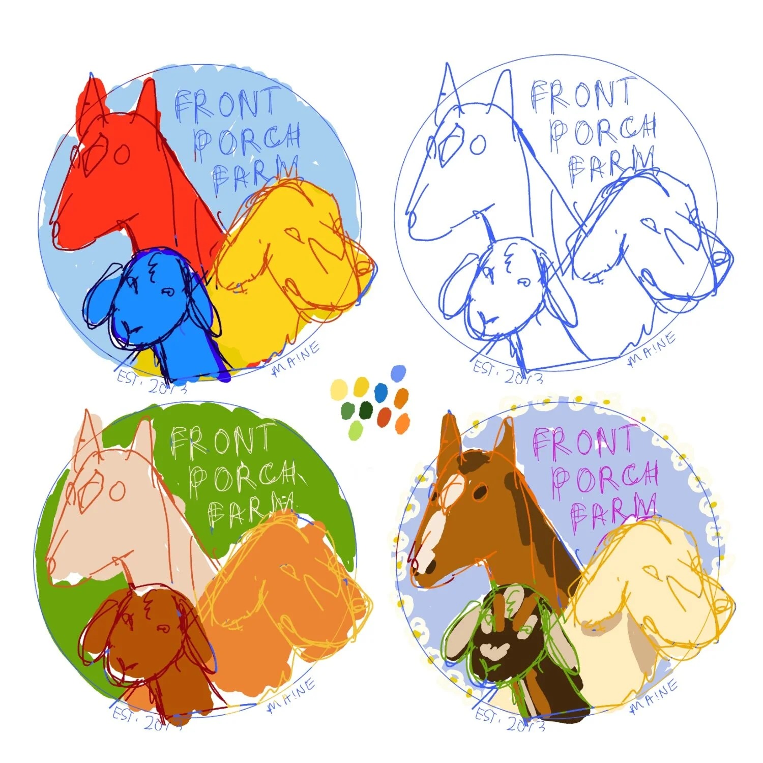
Concept 3 Thought Process I referenced the images of their animals that the Client provided. It seemed that the ones of the most significance was the horse, which was new and fulfilled a childhood dream of both the wife and the granddaughter. The dog seems to be a close pet. Of course I had to include their mascot Daisy. I wanted to try a more circular shape that’s more akin to a seal. I tried a more primary color scheme to keep it bright and eye catching but I ended up liking the third color test the best.
Concept 3 Client Feedback I like the more personal approach our more beloved animals. Feels cozier and more personal. I also like the more natural coloring as that is something we personally resonate and connect with.
Response to Feedback I am going forward with the 3rd color test, perhaps tweaking the composition a bit to improve clarity.
PROBLEM SOLVING
What is the problem that you are trying to solve in your illustration?
The client wants an illustrated logo for their farm.
Thought Process
Client work is about merging the client’s vision with the principles of art and enhanced by the artist’s aesthetics. When I think of an effective logo, I prefer clean lines and distinct easily recognizable imagery. Illustrated logos however can easily get complicated as the lean away from the graphic nature of typical logos. My client also expressed that they weren’t interested in a “cookie cutter graphic from the internet.”
I want something that shows elements that are unique to the farm, without making the graphic too generic. I would like to avoid basic “farm on a field with a sun” that would be too easy to fall into. They used the term whimsical to describe themselves so I think that I will try and push that in the design.
I want the logo to feel warm, friendly and inviting. It is a family owned farm so I want a sense of familiarity and coziness.
Challenges
There are some challenges I am anticipating, including making a logo that is clear when it is printed very small, and that looks just as good blown up. I am considering making variations of the logo that can be used in different contexts, including a greyscale version that can be printed clearly. I also am considering working in a vector based program. Vector drawings look sharp whether very large or small because they are scalable. This is in contrast to pixel based images that when drawn in a certain size doesn’t work when enlarged or look cramped when shrunk.
I also don’t want to overwork the logo and have it look too busy. Although the logo will be in full color, I’d like to keep the palette rather limited so as to avoid a cluttered logo.
Next step: Preliminary Sketches.
TECHNICAL COMPLETION
Technical Specifications
Before I started drawing the final version of the logo, I started thinking about what I should be keeping in mind in terms of specifications. I originally wanted to make the logo a vector based image, but after having difficulty finding a program that I felt comfortable working with I decided to forego this option. I was told that I could convert the pixel based logo into a vector image afterwards so I moved on. Because I wasn’t going to be doing a vector drawing that meant that my drawing had to be a very high resolution and drawn large so that it could be clear if printed large. After reading a few articles on the subject I decided to draw it at 10”x10” at 600dpi. That would allow it to be printed at 20”x20” at 300dpi without any issue. I was also going to keep it within the confines of a square so as to make logo stickers or similar products easy to print.
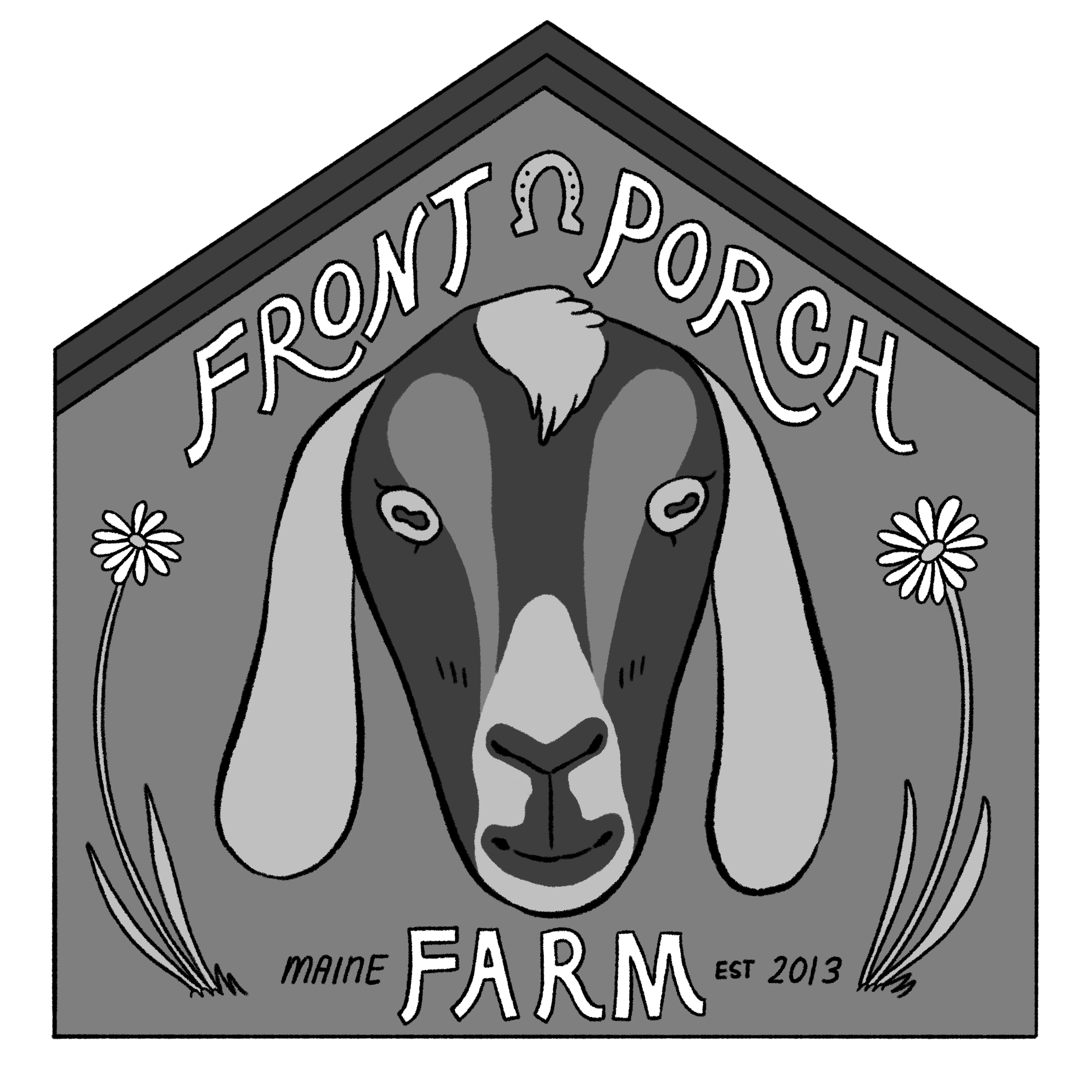
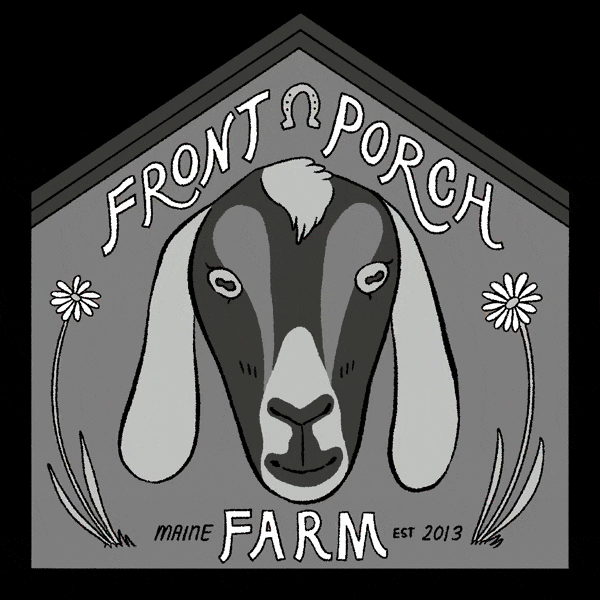
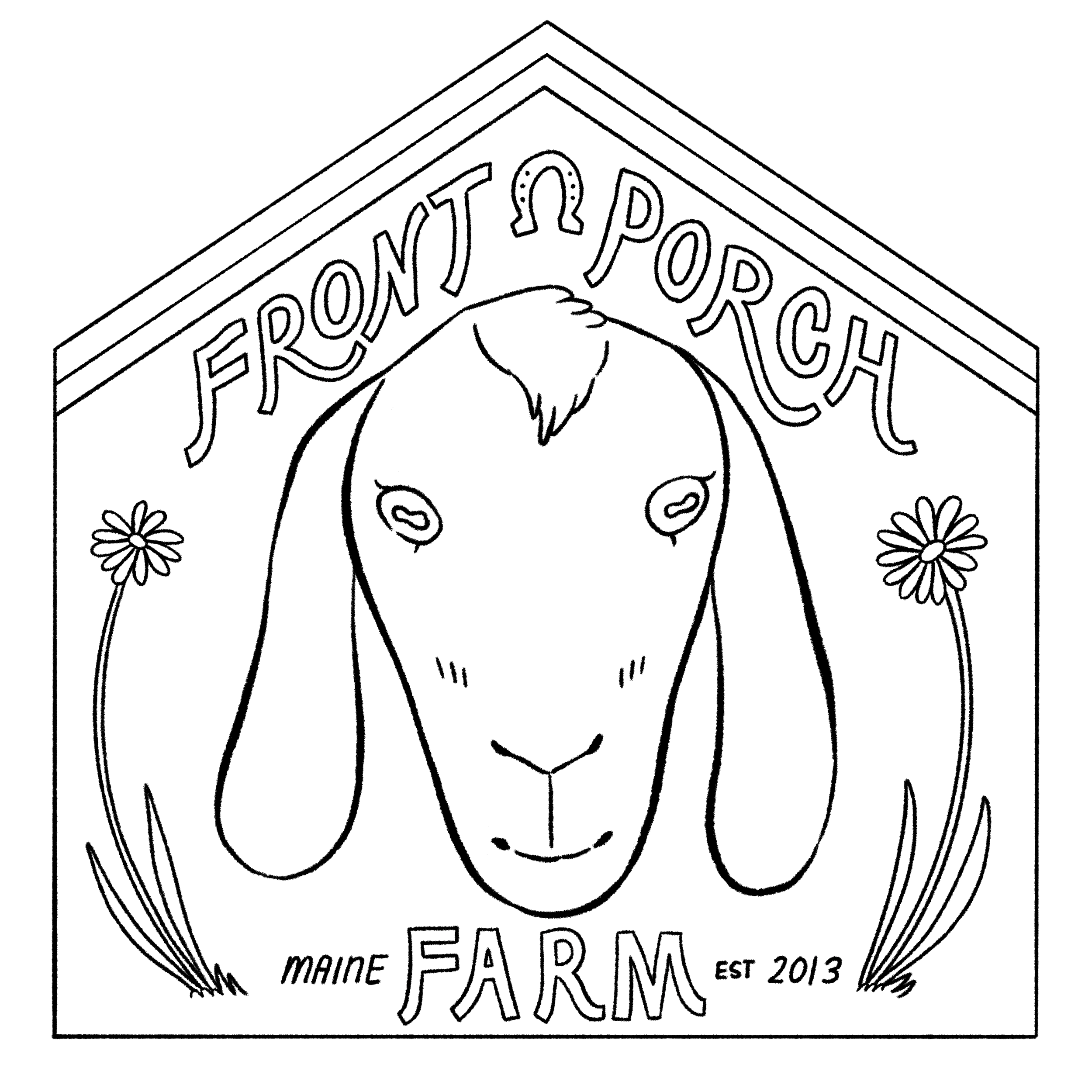
Logo-greyscale
Variations
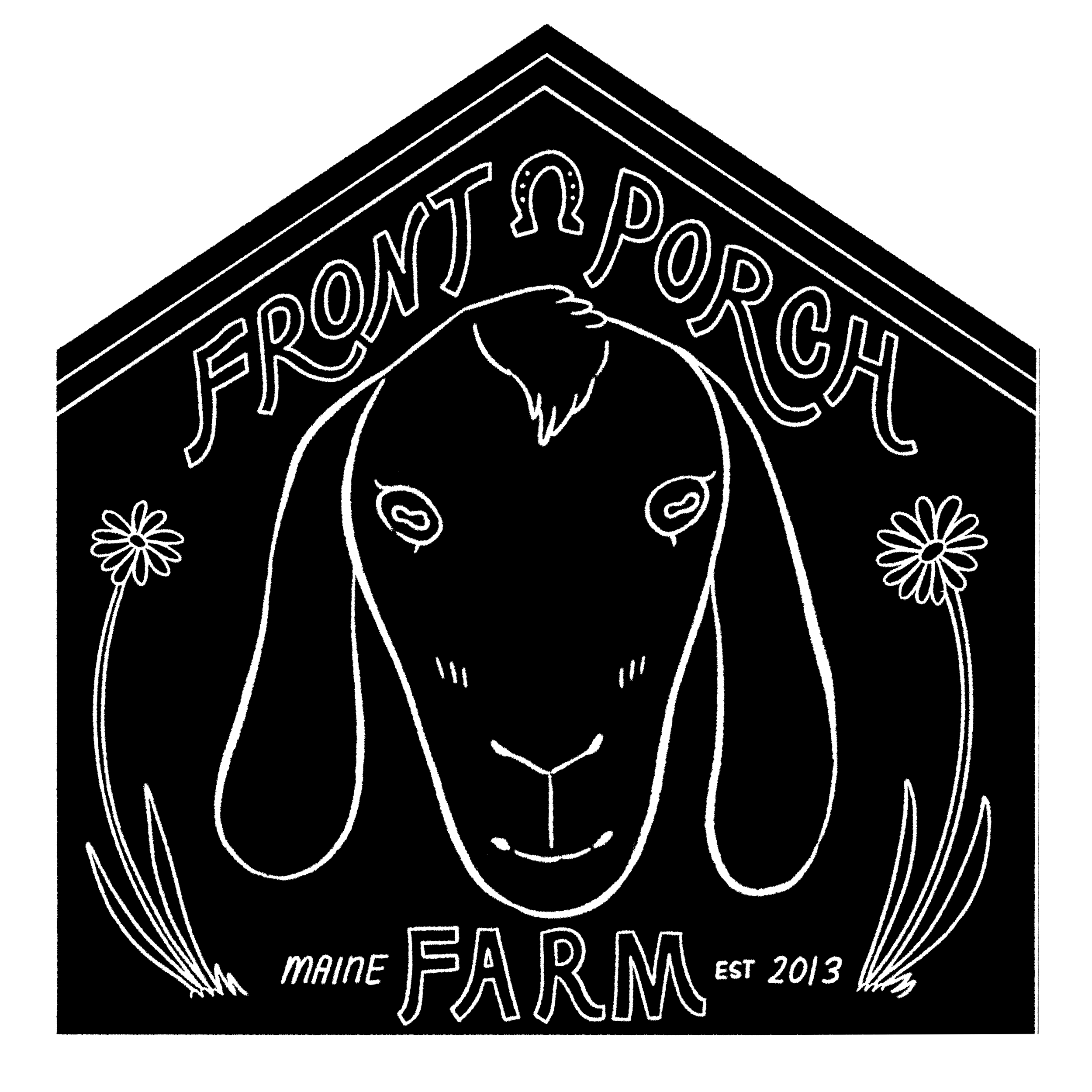
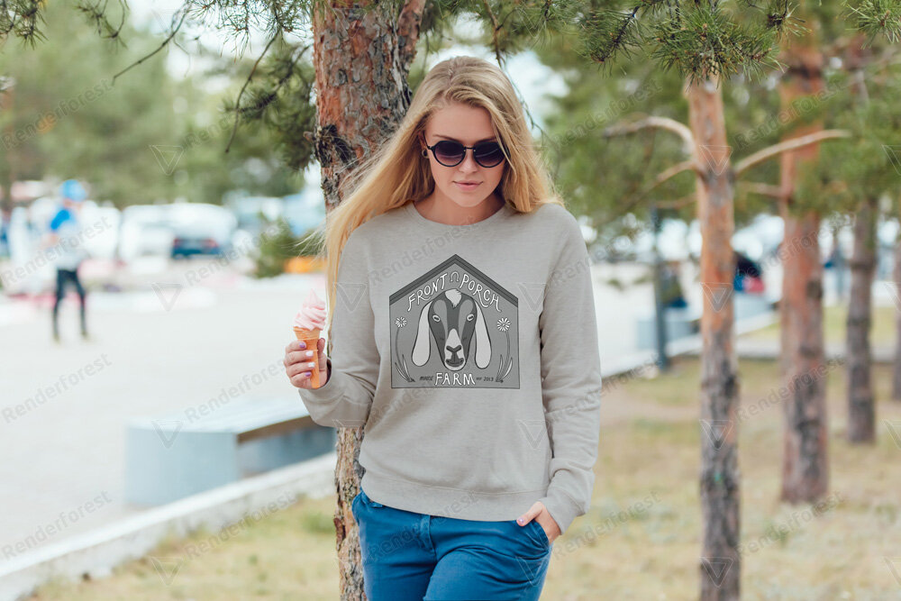
I also wanted to create variations of the logo but I had a tight deadline so I kept this in mind when designing if they wanted to later make changes for different applications. These variations included color variations such as a fully black and white version of the logo. I also wanted to make a greyscale version of the full color logo. A solid color version of the logo as well as an inverse version.
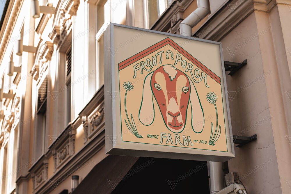
Uses
Their logo could also be used for a Favicon for their website, a simplified version for website banner/header. They might also want to use it for a social media icon. The wordmark (logotype/typography) that I wrote the name of the farm can also be used separately from its illustrated logo. I visited Looka in order to get resources on branding and logos. They were especially helpful in getting information on logo sizes and the psychology of color use in logos.
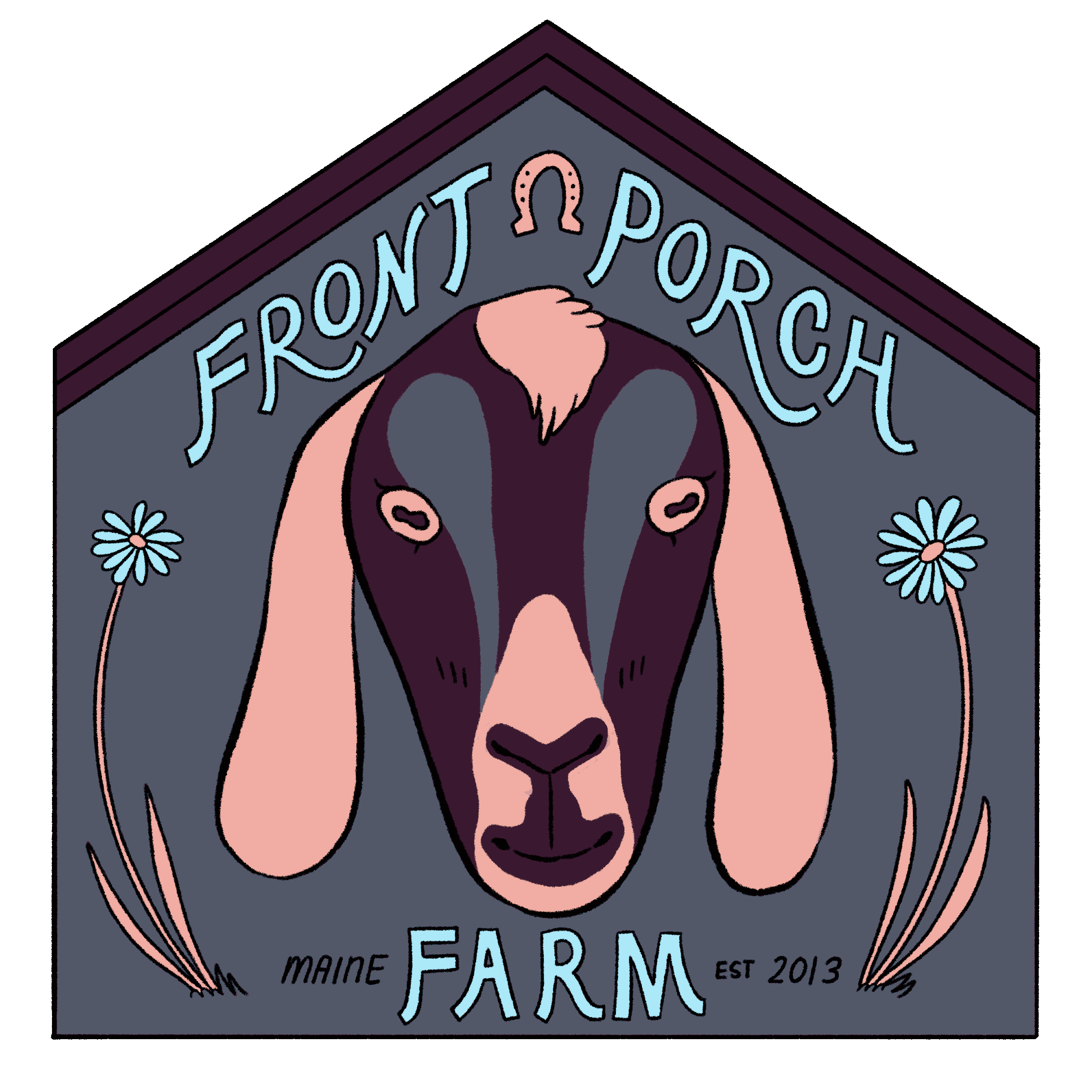
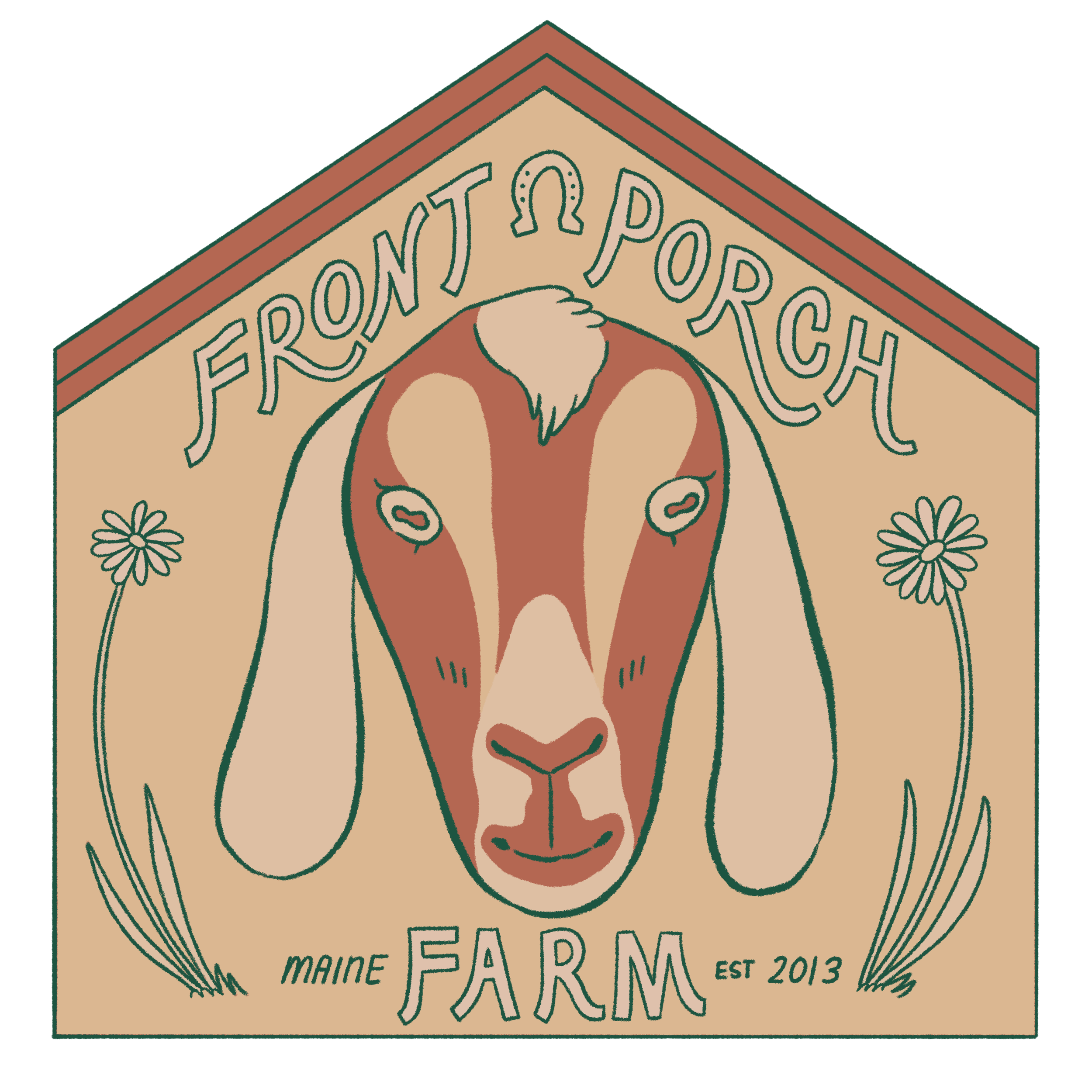
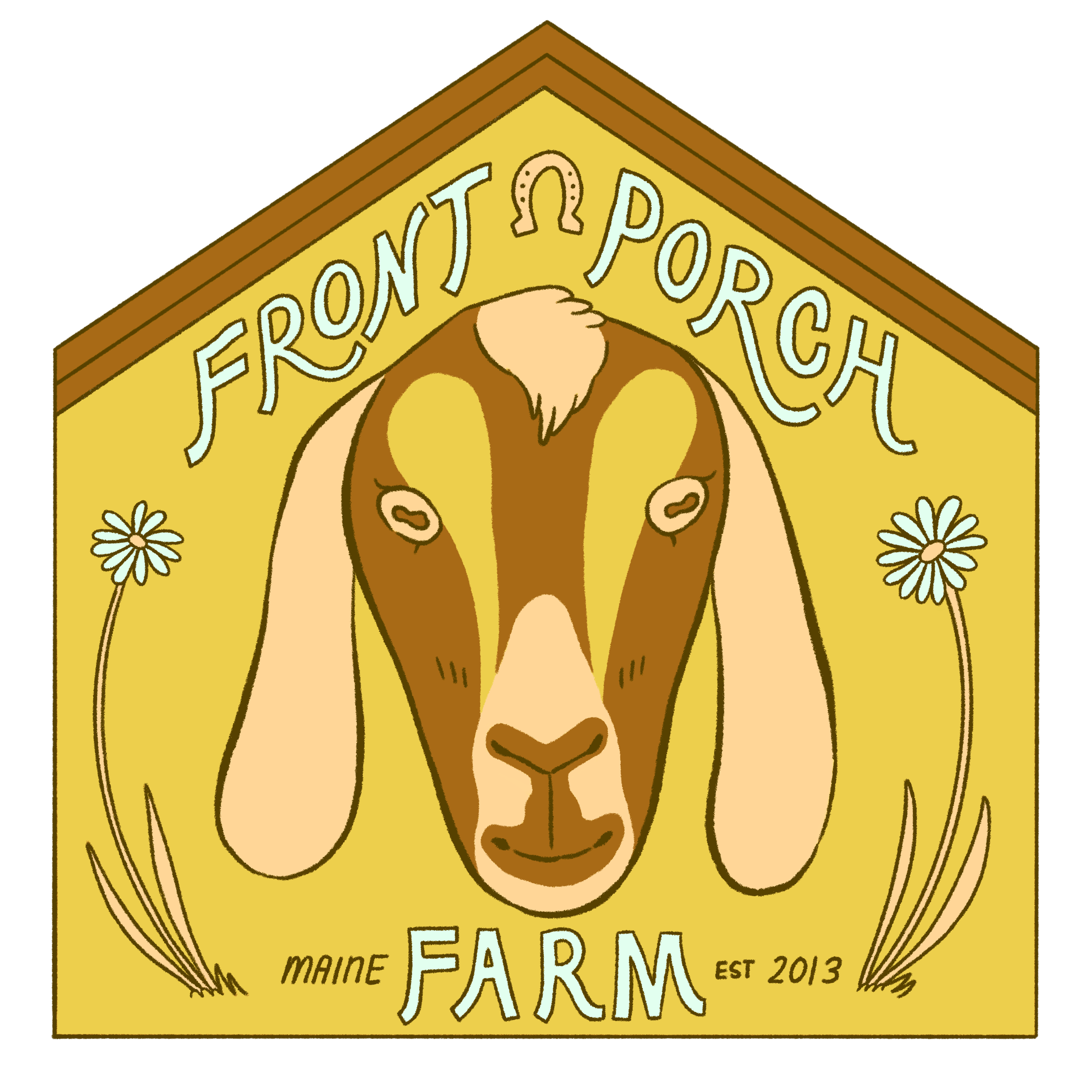
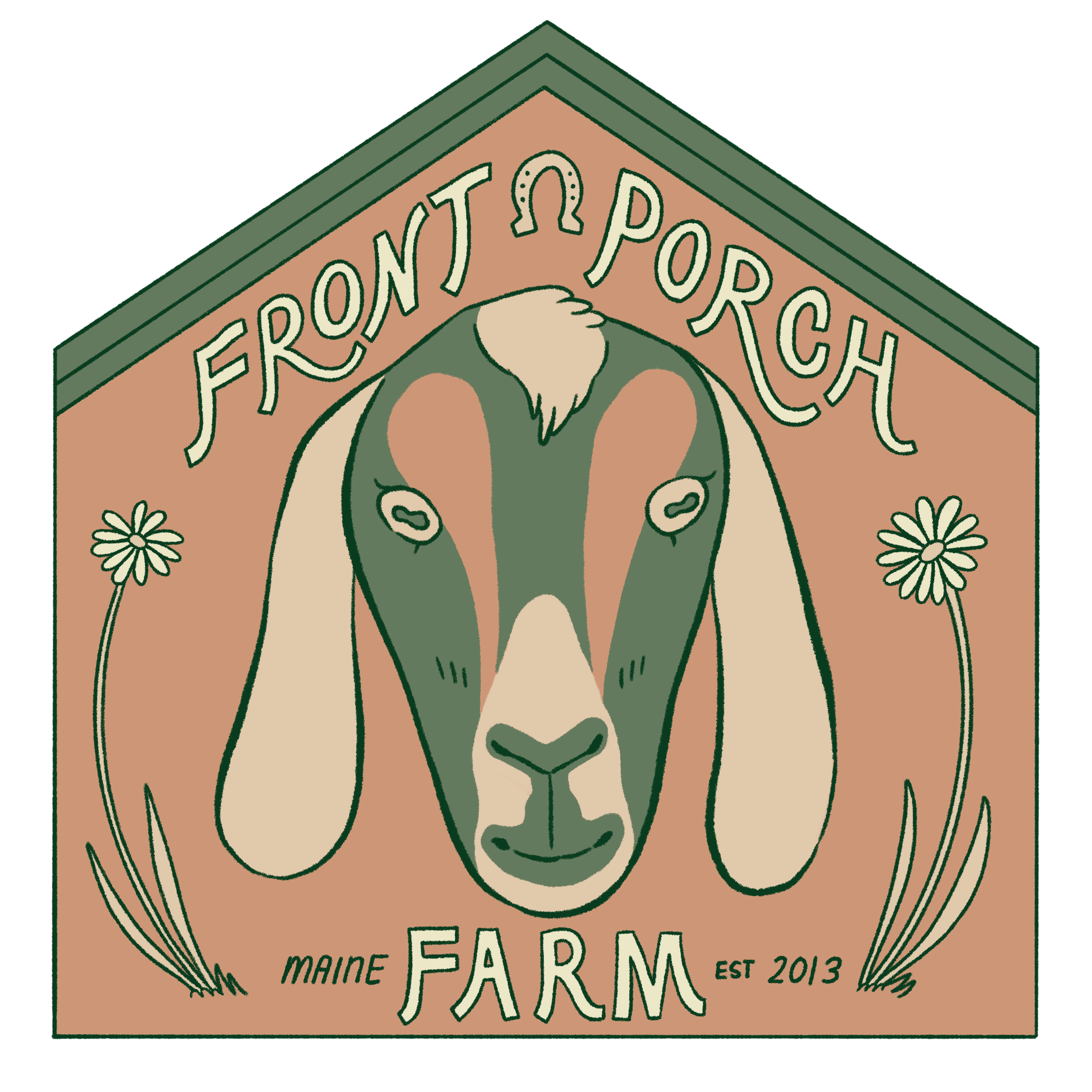
On the left are the different color tests I did for the logo. Because every color palette gives a different connotations and feelings I had to be careful that the color scheme I chose was in line with the desires of the client.
The final colors I chose for the logo are below. I wanted to focus on green, orange and blue. The orange and green would relate to the barn colors and the blue would be the clients’ sky and pond. Unfortunately many of the designs with blue felt too “water” based and weren’t in line with what I felt Front Porch Farm wanted as a mood. The client was weary of some of the green designs, citing that they looked a little military like, so I opted out of the more monotone greens. A few of the purples also looked quite garish so I didn’t choose them for the final color palettes. I liked the yellow based logo because it felt warm and inviting. I tried to keep the colors muted so that it would convey feelings of coziness.
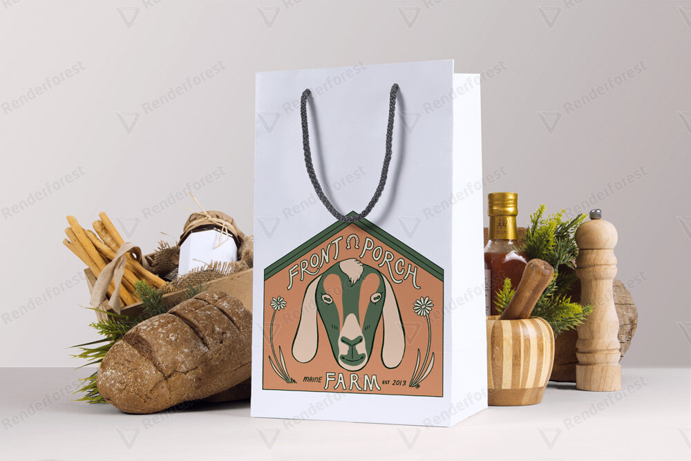
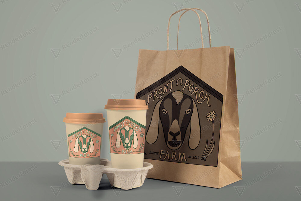
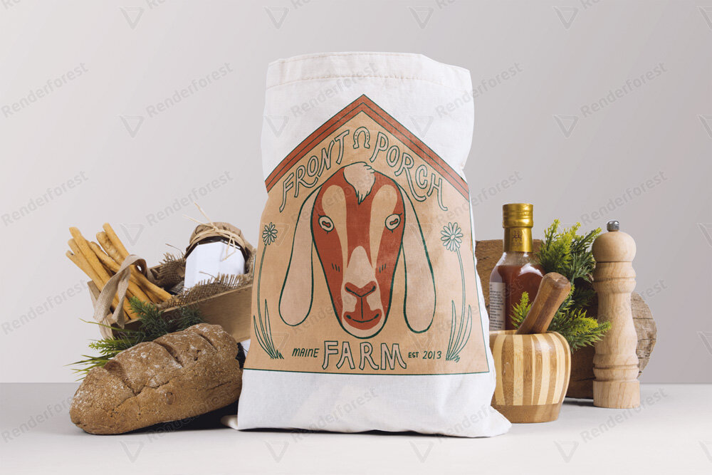
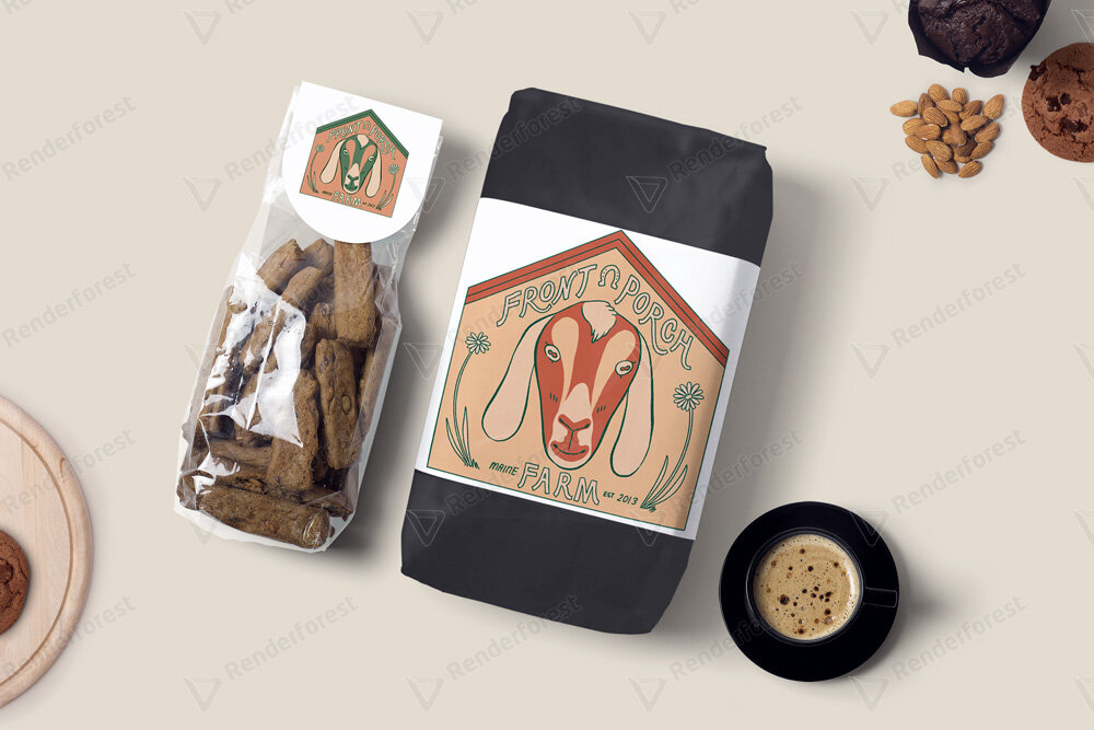
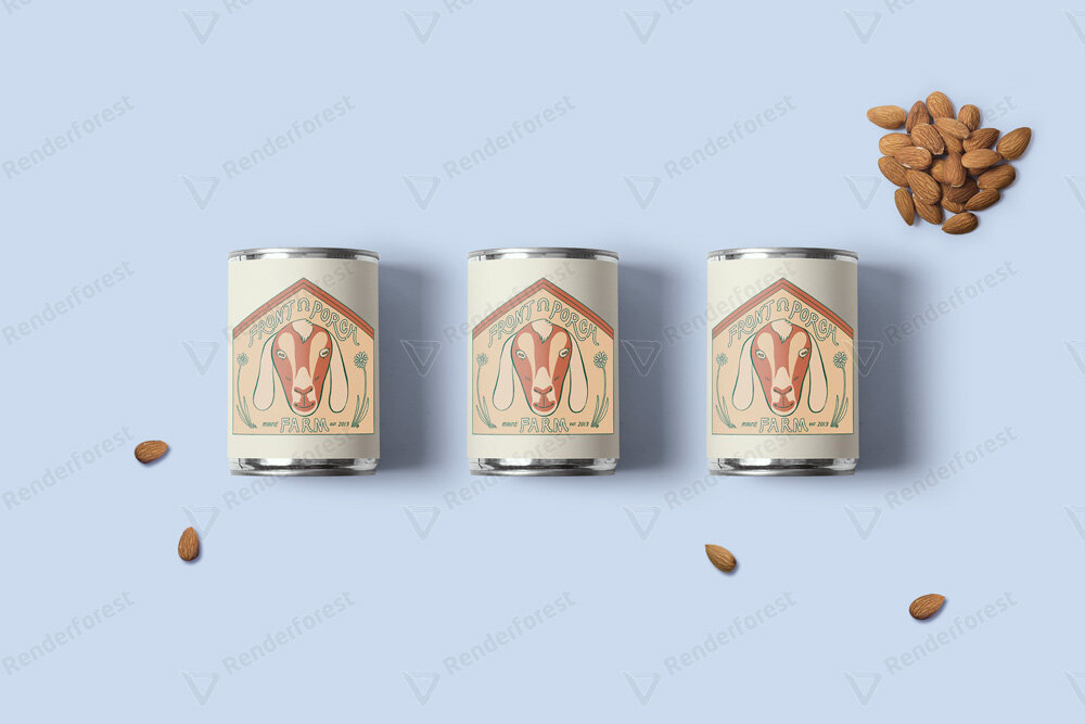
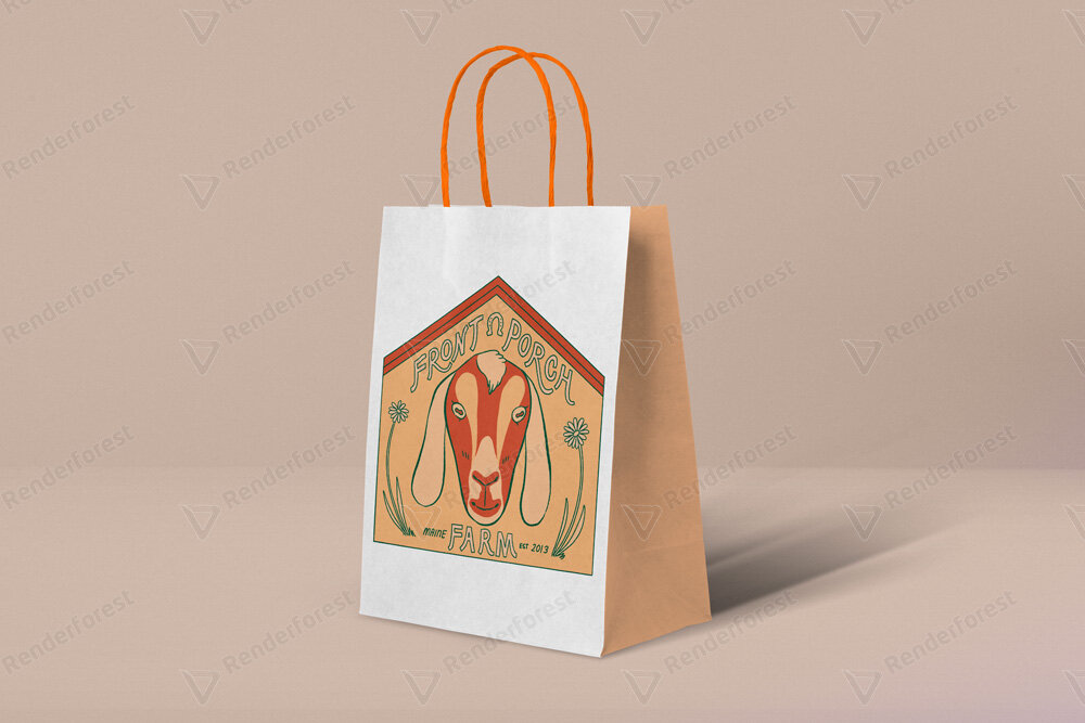
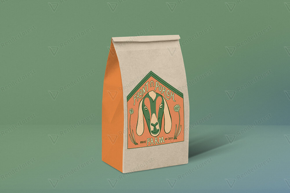
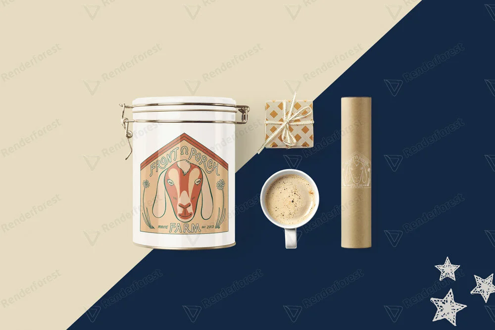
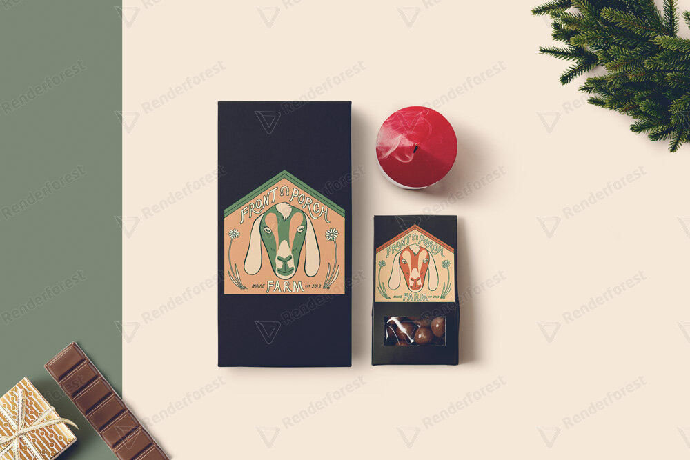
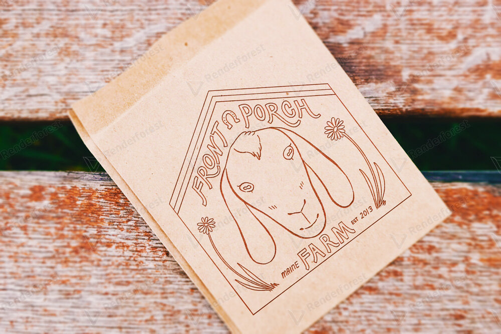
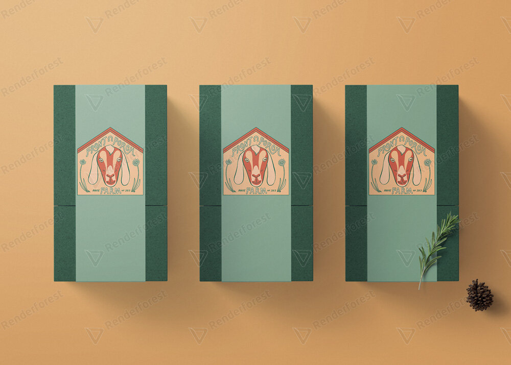
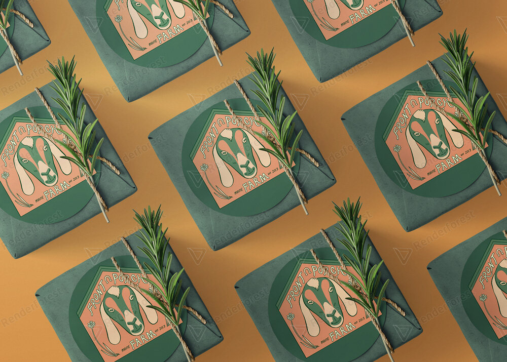
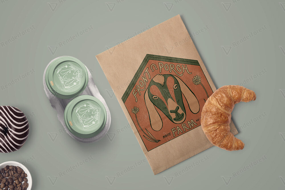
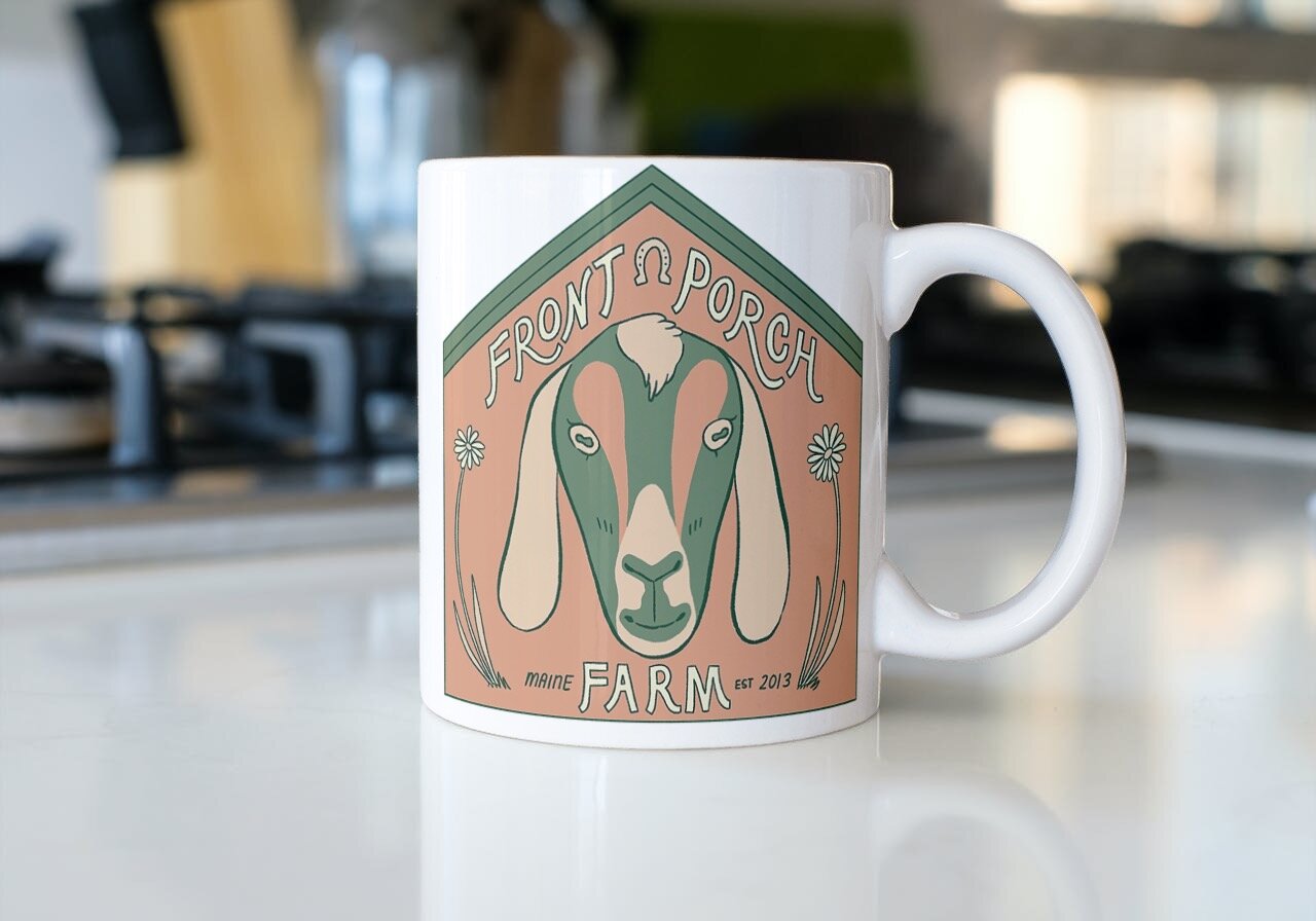
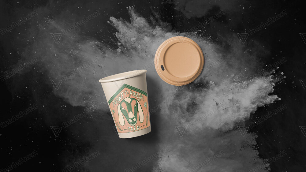
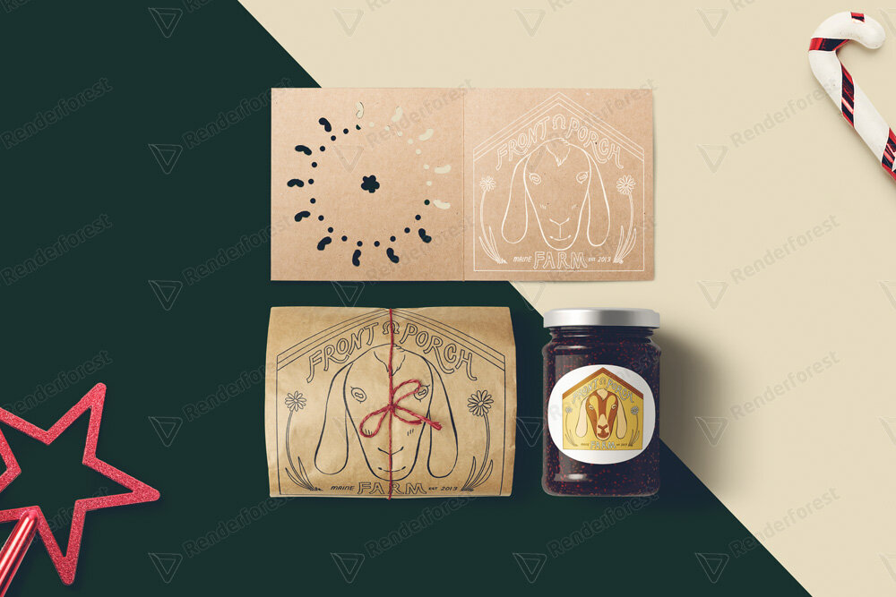
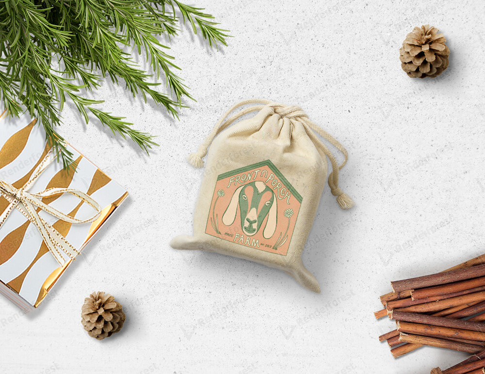
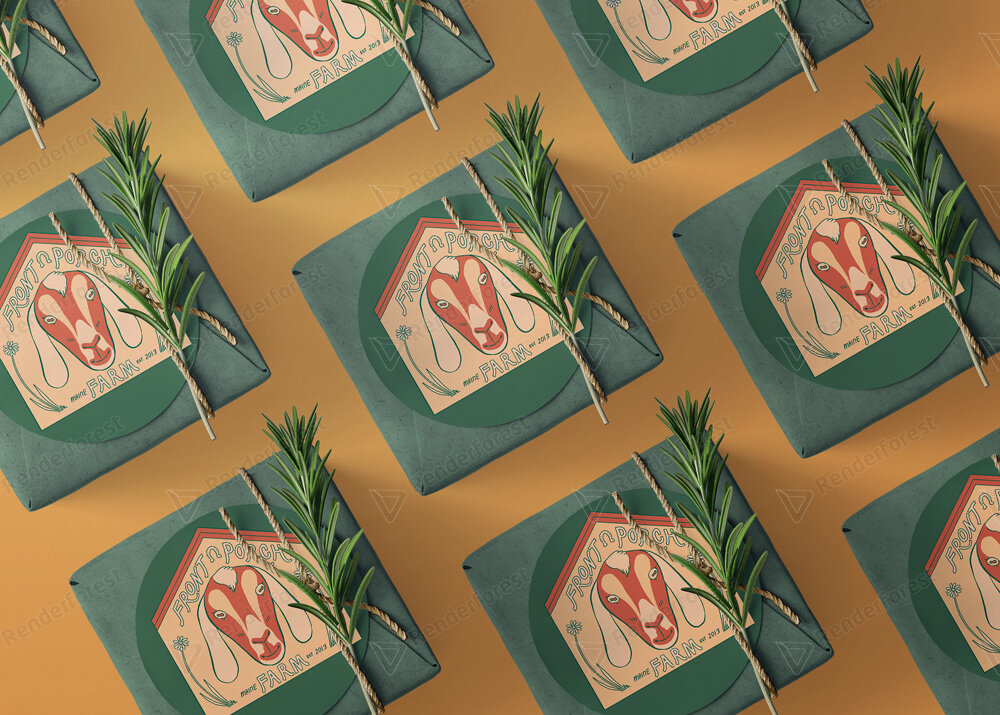
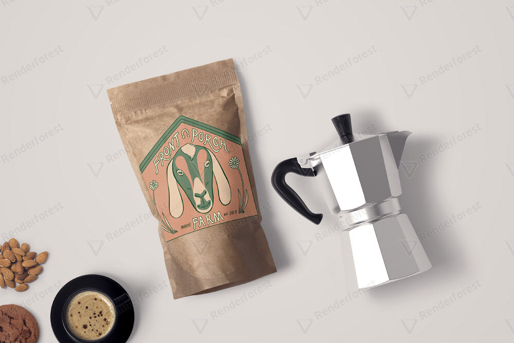
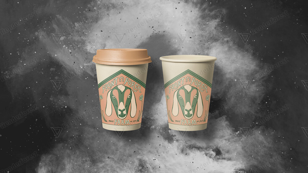
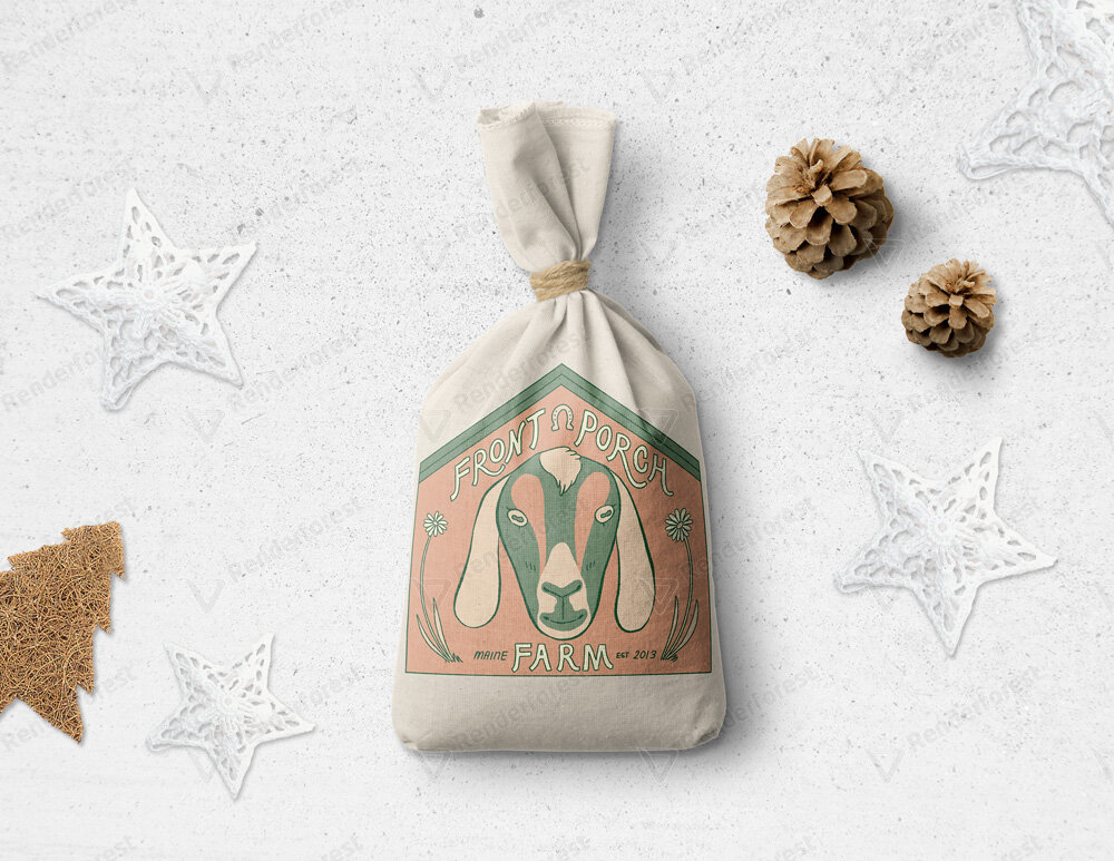
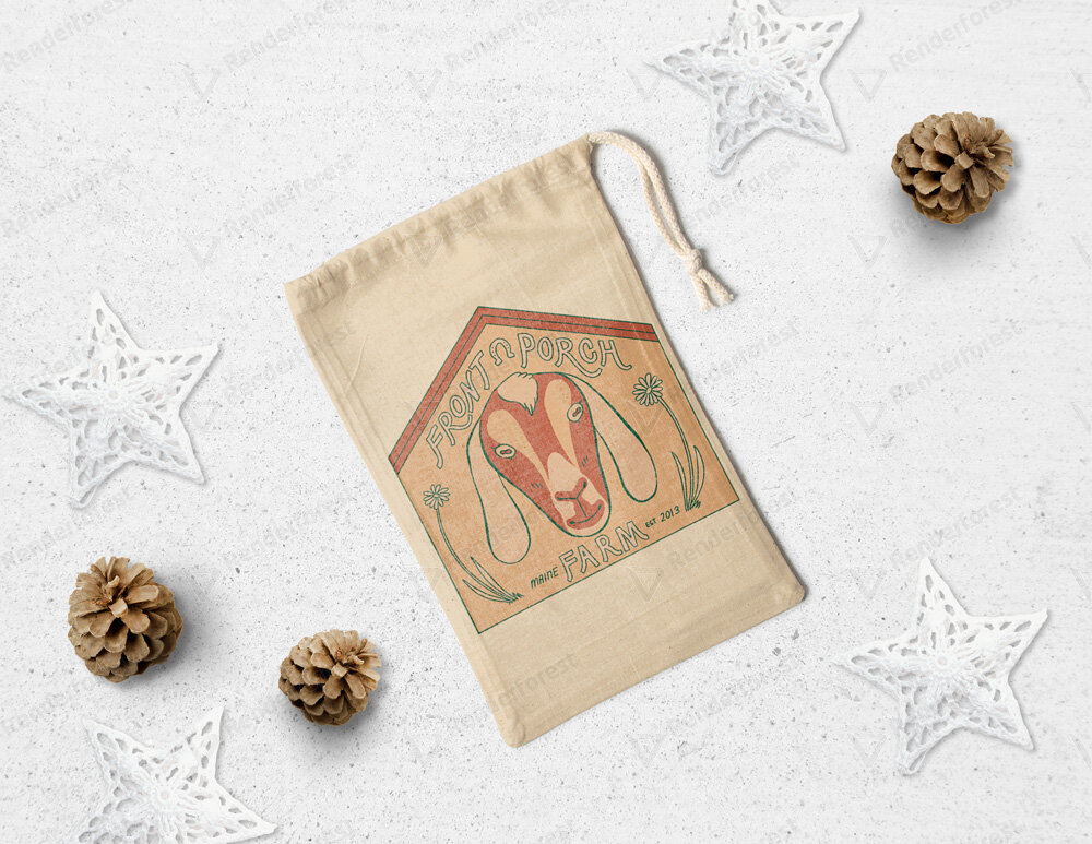
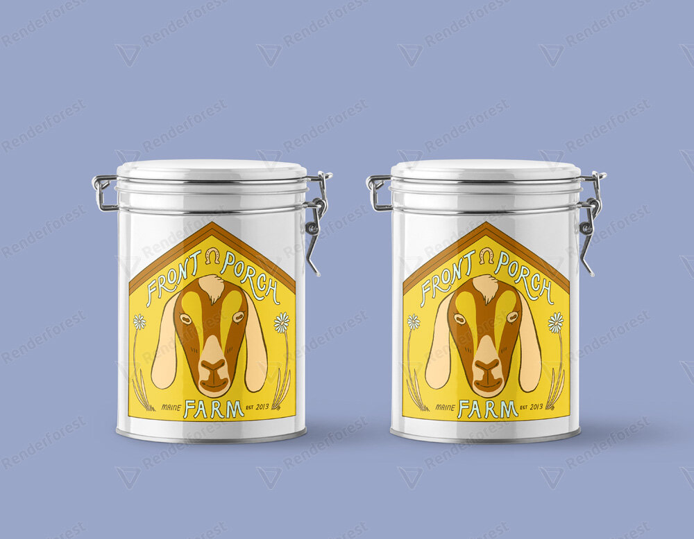
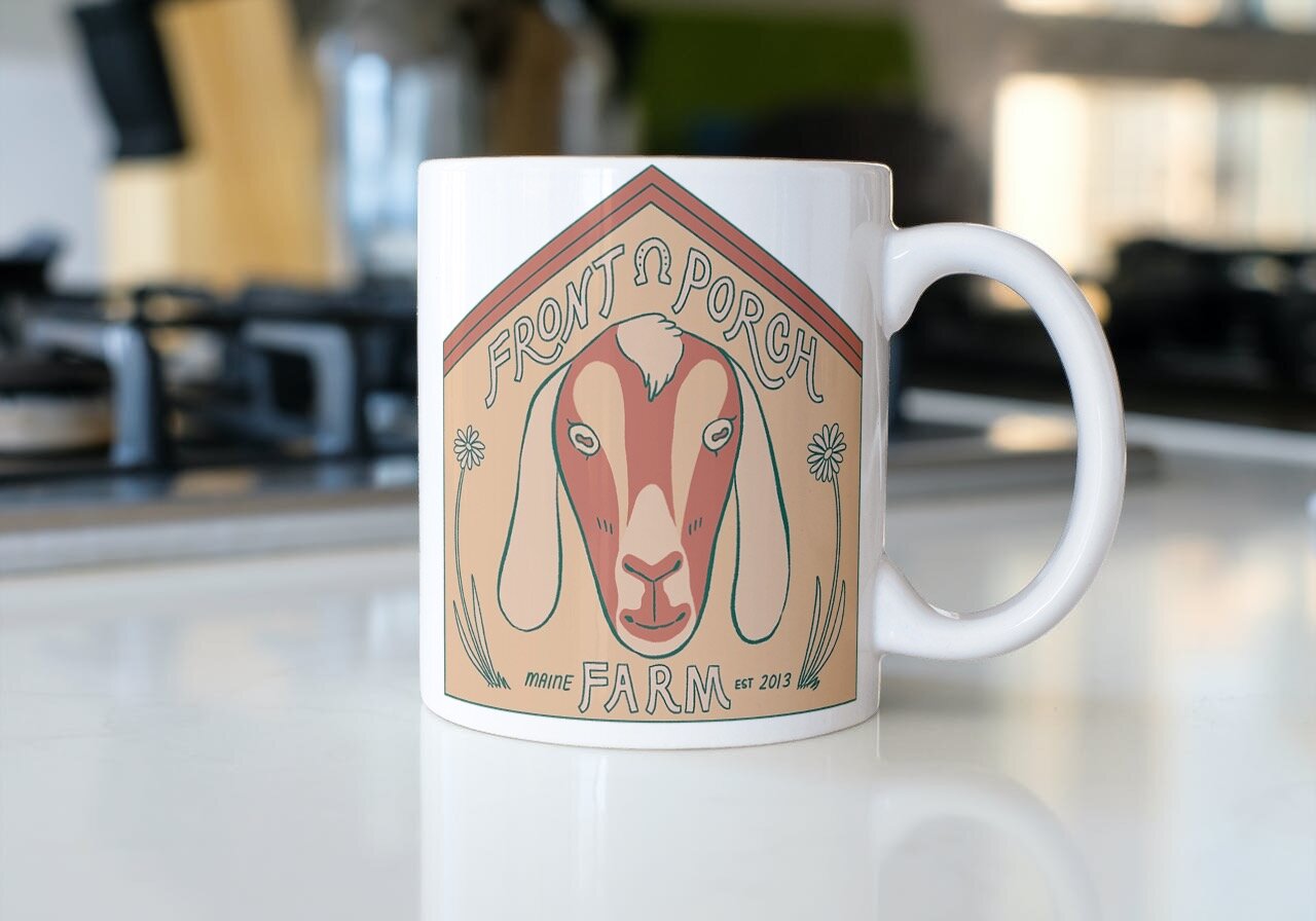
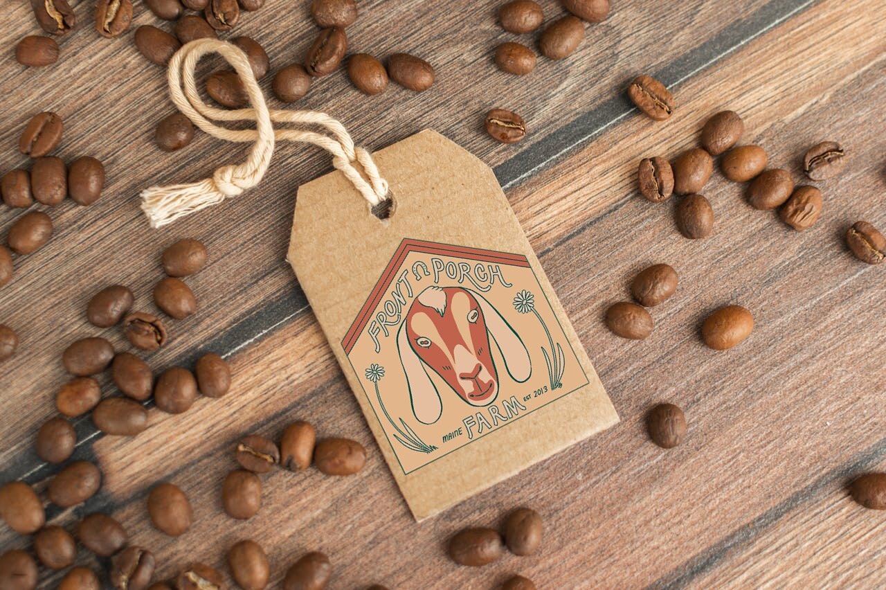
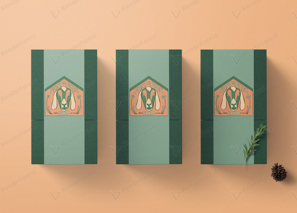
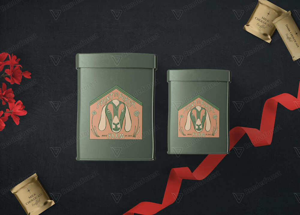
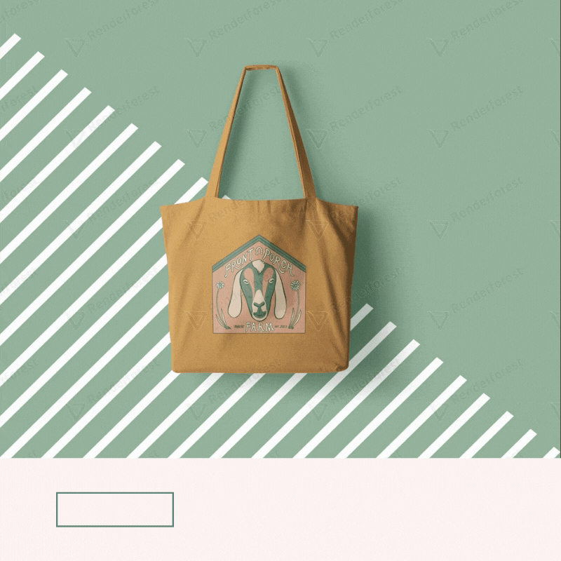
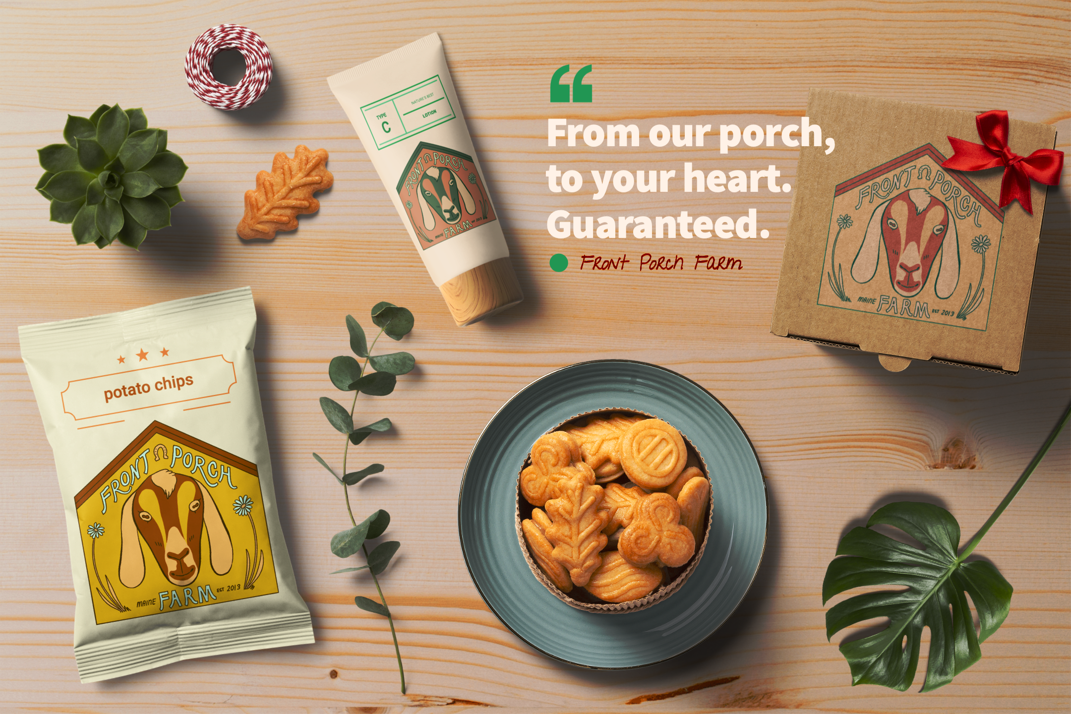
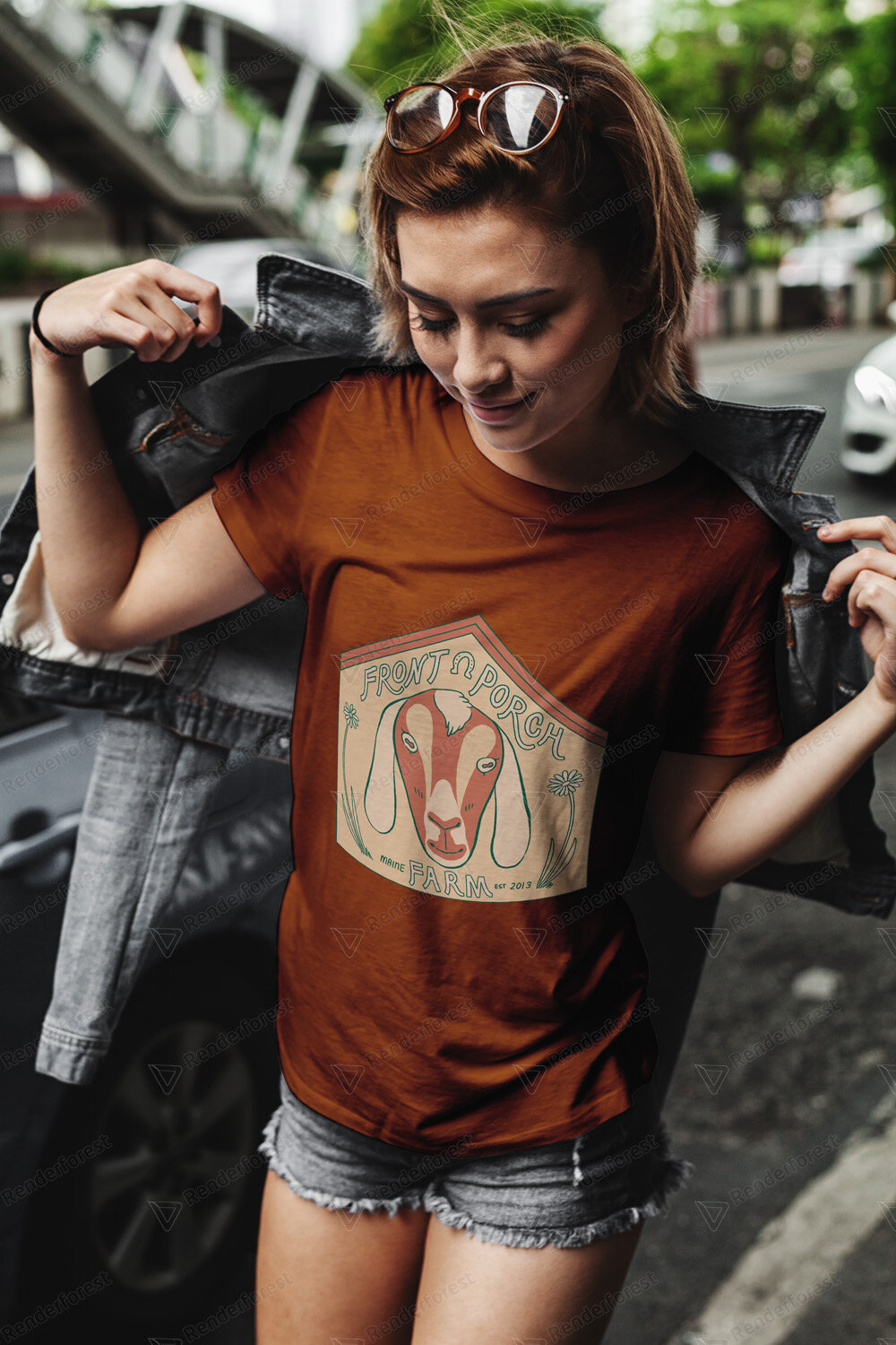
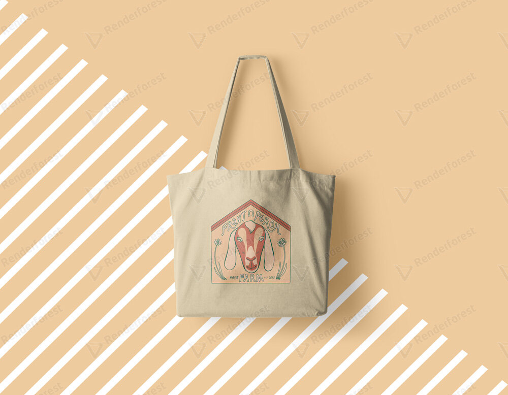
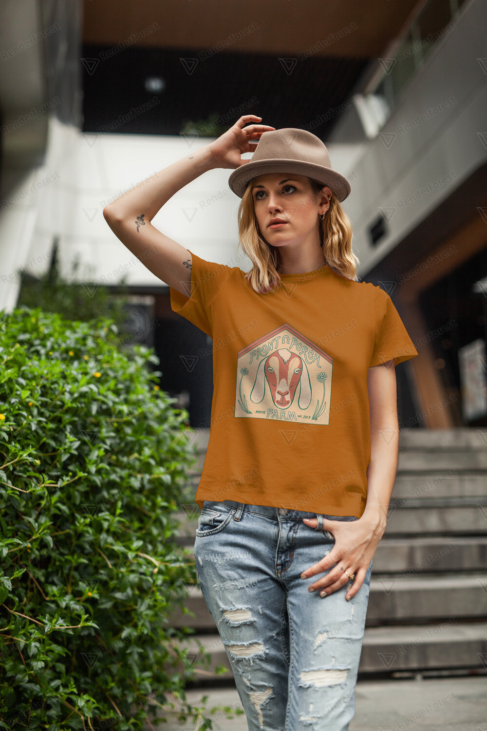
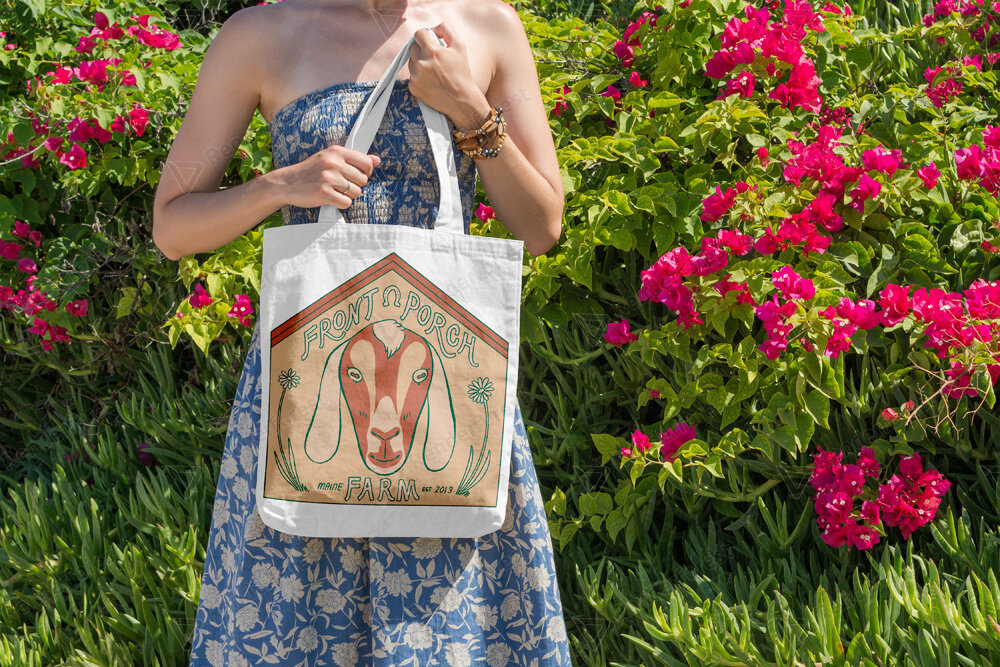
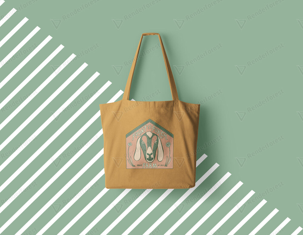
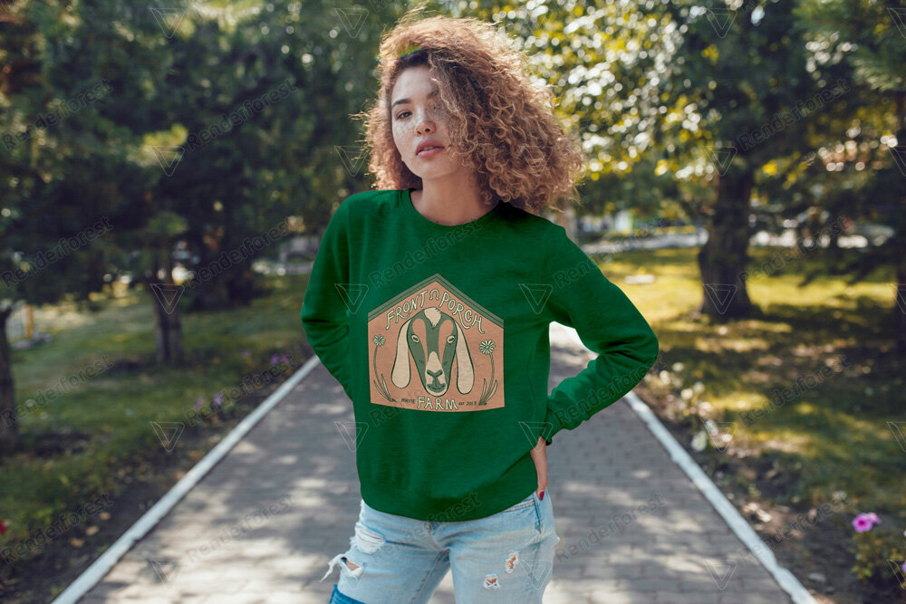
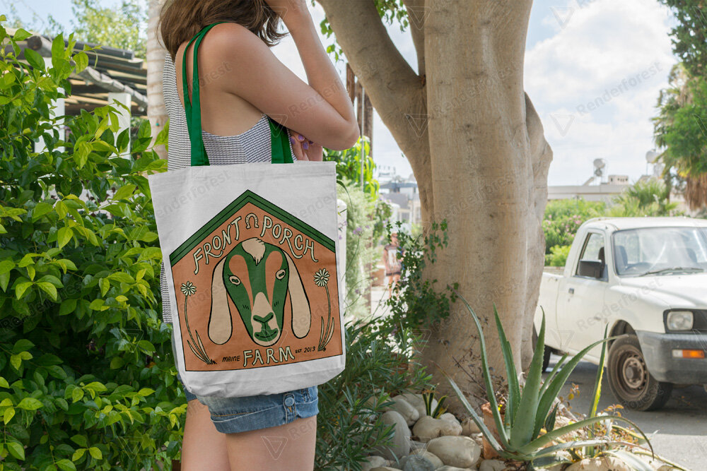
MockUps
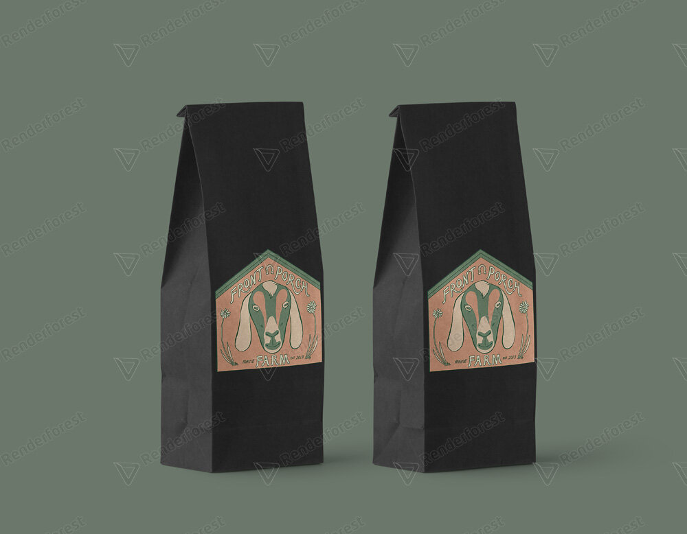
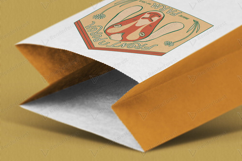
It was important for me that the Client could envision the logo being used practically. I used a free mock up generator to try and visualize the logo on different products. The beauty of mockup generators is that they can be altered for different applications. I put the logo on apparel and accessories as well as drink-ware and packages. I used both Renderforest and Smartmockups to place the logo on the images below.
A resource I especially enjoyed was Artboard Studio which I used to make the image at the top of this page. It offered my an incredible degree of customization so the client could see their logo used on different packaging in relation to one another.
Apparel and Accessories
DRINK-WARE AND PACKAGING